取两列数据绘制散点图,需使用scatter函数
import pandas as pd
reviews = pd.read_csv('fandango_scores.csv')
cols = ['FILM', 'RT_user_norm', 'Metacritic_user_nom', 'IMDB_norm', 'Fandango_Ratingvalue', 'Fandango_Stars']#取一些列做新的数据
norm_reviews = reviews[cols]
print(norm_reviews[0:2])
'''
FILM RT_user_norm Metacritic_user_nom \
0 Avengers: Age of Ultron (2015) 4.3 3.55
1 Cinderella (2015) 4.0 3.75
IMDB_norm Fandango_Ratingvalue Fandango_Stars
0 3.90 4.5 5.0
1 3.55 4.5 5.0
'''
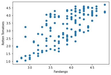
#Let's look at a plot that can help us visualize many points.
fig, ax = plt.subplots()
ax.scatter(norm_reviews['Fandango_Ratingvalue'], norm_reviews['RT_user_norm'])#使用scatter函数
ax.set_xlabel('Fandango')
ax.set_ylabel('Rotten Tomatoes')
plt.show()
交换下坐标轴数据
#Switching Axes
fig = plt.figure(figsize=(5,10))
ax1 = fig.add_subplot(2,1,1)
ax2 = fig.add_subplot(2,1,2)
ax1.scatter(norm_reviews['Fandango_Ratingvalue'], norm_reviews['RT_user_norm'])
ax1.set_xlabel('Fandango')
ax1.set_ylabel('Rotten Tomatoes')
ax2.scatter(norm_reviews['RT_user_norm'], norm_reviews['Fandango_Ratingvalue'])
ax2.set_xlabel('Rotten Tomatoes')
ax2.set_ylabel('Fandango')
plt.show()


