文章目录
- css_writing-mode 文本流方向
- reference
- 基本概念
- Introduction to Writing Modes
- horizontal writing mode
- vertical writing mode
- examples
- preview
- html
- css
css_writing-mode 文本流方向
reference
- writing-mode | CSS-Tricks - CSS-Tricks
- writing-mode - CSS: Cascading Style Sheets | MDN (mozilla.org)
- CSS Writing Modes Level 3 (w3.org)
- CSS Logical Properties nd Values - CSS: Cascading Style Sheets | MDN (mozilla.org)
基本概念
Introduction to Writing Modes
CSS Writing Modes Level 3 defines CSS features to support for various international writing modes, such as left-to-right (e.g. Latin or Indic), right-to-left (e.g. Hebrew or Arabic), bidirectional (e.g. mixed Latin and Arabic) and vertical (e.g. Asian scripts).
- A writing mode in CSS is determined by thewriting-mode,direction, andtext-orientation properties. It is defined primarily in terms of itsinline base direction andblock flow direction:

- Latin-based writing mode

Mongolian-based writing mode


Han-based writing mode

Latin-based writing mode
- The
inline base direction is the primary direction in which content is ordered on a line and defines on which sides the “start” and “end” of a line are.
- Thedirection property specifies the inline base direction of a box and, together with theunicode-bidi property and the inherent directionality of any text content, determines the ordering of inline-level content within a line.
- The
block flow direction is the direction in which block-level boxes stack and the direction in which line boxes stack within a block container.
- Thewriting-mode property determines the block flow direction.
The typographic mode determines if text should apply typographic conventions specific to vertical flow for vertical scripts. This concept distinguishes vertical flow for vertical scripts from rotated horizontal flow.
horizontal writing mode
- A horizontal writing mode is one with horizontal lines of text,
- i.e. a downward or upward block flow.
vertical writing mode
- A vertical writing mode is one with vertical lines of text
- i.e. a leftward or rightward block flow.
These terms should not be confused with vertical block flow (which is a downward or upward block flow) and horizontal block flow (which is leftward or rightward block flow). To avoid confusion, CSS specifications avoid this latter set of terms.
Writing systems typically have one or two native writing modes. Some examples are:
- Latin-based systems are typically written using a left-to-right inline direction with a downward (top-to-bottom) block flow direction.
- Arabic-based systems are typically written using a right-to-left inline direction with a downward (top-to-bottom) block flow direction.
- Mongolian-based systems are typically written using a top-to-bottom inline direction with a rightward (left-to-right) block flow direction.
- Han-based systems are commonly written using a left-to-right inline direction with a downward (top-to-bottom) block flow direction,ora top-to-bottom inline direction with a leftward (right-to-left) block flow direction. Many magazines and newspapers will mix these two writing modes on the same page.
The text-orientation component of the writing mode controls the glyph orientation.
examples
preview
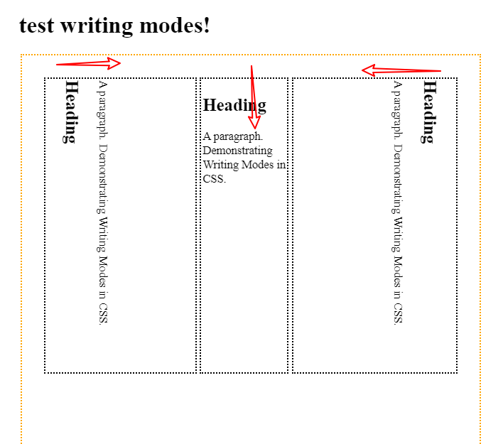
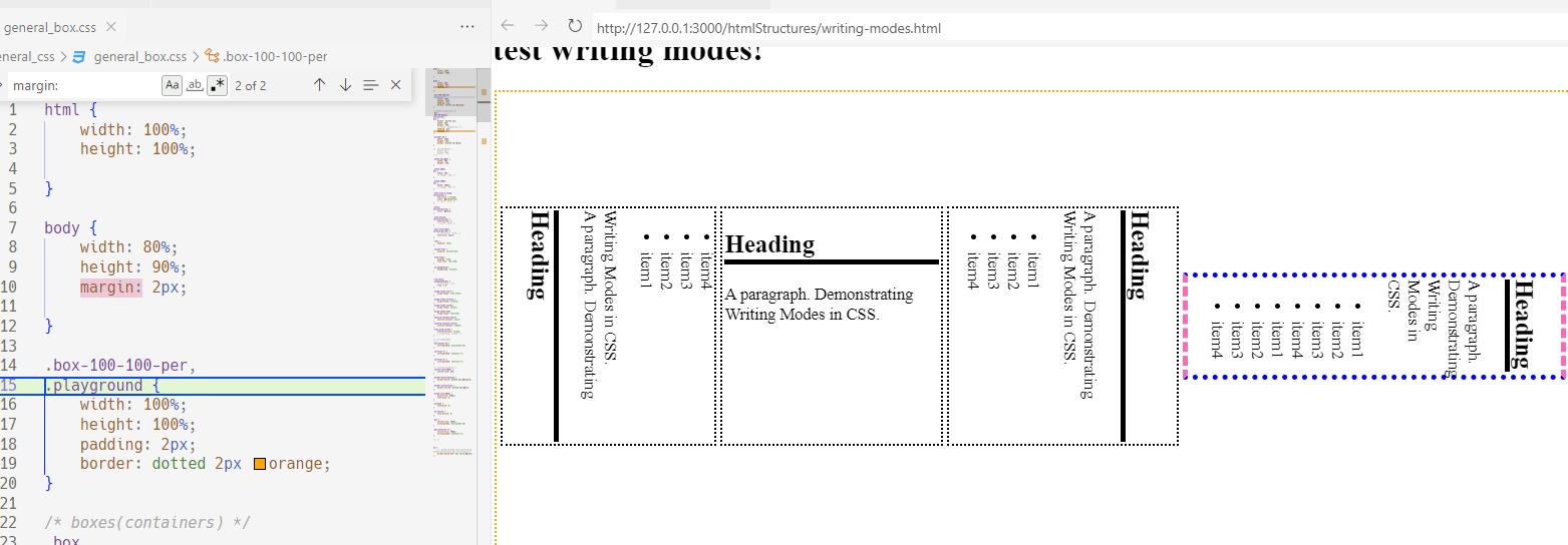
- 箭头指出了文本流栈的出栈方向(阅读顺序/方向)


html
<html lang="en">
<head>
<meta charset="UTF-8">
<meta
http-equiv="X-UA-Compatible"
content="IE=edge"
>
<meta
name="viewport"
content="width=device-width, initial-scale=1.0"
>
<title>Document</title>
<link
rel="stylesheet"
href="./../general_css/general_box.css"
>
</head>
<body>
<!-- <div></div> -->
<h1>test writing modes!</h1>
<div class="box-100-100-per flex align-items-center justify-content-start flex-wrap ">
<div class="vertical-lr">
<h2>Heading</h2>
<p>A paragraph. Demonstrating Writing Modes in CSS.</p>
<ul>
<li>item1</li>
<li>item2</li>
<li>item3</li>
<li>item4</li>
</ul>
</div>
<div class="horizontal-tb width_20per">
<h2>Heading</h2>
<p>A paragraph. Demonstrating Writing Modes in CSS.</p>
</div>
<div class=" vertical-rl width_20per flex-grow">
<h2>Heading</h2>
<p>A paragraph. Demonstrating Writing Modes in CSS.</p>
<ul>
<li>item1</li>
<li>item2</li>
<li>item3</li>
<li>item4</li>
</ul>
</div>
<!-- test logical-properties: -->
<div class=" vertical-rl flex-grow inline-size-20per block-size-50per border-block-hotpink border-inline-blue ">
<h2>Heading</h2>
<p>A paragraph. Demonstrating Writing Modes in CSS.</p>
<ul>
<li>item1</li>
<li>item2</li>
<li>item3</li>
<li>item4</li>
<li>item1</li>
<li>item2</li>
<li>item3</li>
<li>item4</li>
</ul>
</div>
</div>
</body>
</html>css
html {
    width: 100%;
    height: 100%;

}

body {
    width: 80%;
    height: 90%;
    margin: 2px;

}

.box-100-100-per,
.playground {
    width: 100%;
    height: 100%;
    padding: 2px;
    border: dotted 2px orange;
}

/* boxes(containers) */
.box,
.box-48-50-per,
section>div,
div {
    border: dotted 2px;
    width: 48%;
    height: 50%;
    /* color: aquamarine; */
    padding: 2px;
    margin: 2px;
}

.divider-10 {
    width: 100%;
    height: 10%;
    border: dotted 2px red;
}

/* .box-48-50-per {
    width: 48%;
    height: 50%;
} */

.width_20_20per {
    width: 20%;
    height: 20%;
}

.width_20per,
div {
    width: 20%;
    /* height: 20%; */
}

.width_200px,
div {
    width: 200px;
    /* height: 40%; */
}

.font-size-x-large,
section>div {
    font-size: x-large;
    color: greenyellow;
    /* color: blue; */
}

.black,
section>div>div {
    color: black;
}

.flex-shrink,
section>div>div {
    flex-shrink: 1;
    /* color: aqua; */
}

.font-size-small,
section>div>div {
    /* font-size: .8rem; */
    font-size: small;
}

.flex {
    display: flex;
}

.inline-flex {
    display: inline-flex;
}

.flex-wrap {
    display: flex;
    flex-flow: row wrap;
}

.no_background {
    background: initial;
}


.flex-grow,
.playground>div {
    /*flex-grow: 1;*/
    flex: 1 0;
}

.align-items-start {
    align-items: flex-start;
}

.align-items-stretch {
    align-items: stretch;
}
.align-items-center{
    align-items: center;
}
.align-items-end{
    align-items: flex-end;
}
.justify-content-start{
    justify-content: start;
}
.justify-content-center{
    justify-content: center;
}
.flex-wrap-column {
    flex-direction: column;
    /* flex-flow: column; */
}

/* .writing-mode{
} */
.horizontal-tb {
    writing-mode: horizontal-tb;
}

.vertical-rl {
    writing-mode: vertical-rl;
}

.vertical-lr {
    writing-mode: vertical-lr;
}

/*! writing property */
.inline-size-20per {
    inline-size: 20%;
}

.border-block-hotpink {
    border-block: dashed 5px hotpink;
}

.border-inline-blue {
    border-inline: dotted 5px blue
}

.block-size-50per {
    block-size: 500px;
    flex-grow: 0;
}

.no-grow {
    flex-grow: 0;
}

.no-shrink {
    flex-shrink: 0;
}

.box {
    inline-size: 200px;
    writing-mode: horizontal-tb;
}

.box-vertical-rl {
    inline-size: 200px;
    writing-mode: vertical-rl;
}

/*  */


h2 {
    /*  border-bottom: 5px solid black;
border-block-start:5px solid black;*/
    border-block-end: 5px solid black;
}


