使用非常简单,属性不多,常用的更是没几个,自带就有阴影和圆角了
compile 'com.android.support:cardview-v7:25.3.1'<android.support.v7.widget.CardView
android:id="@+id/cardView"
android:layout_width="match_parent"
android:layout_height="wrap_content"
android:layout_margin="10dp"
android:foreground="?android:attr/selectableItemBackground"
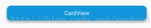
app:cardBackgroundColor="#1296db"
app:cardCornerRadius="10dp"
app:cardElevation="10dp"
app:contentPadding="10dp">
<TextView
android:layout_width="match_parent"
android:layout_height="wrap_content"
android:gravity="center"
android:text="@string/card_view"
android:textColor="#fff"/>
</android.support.v7.widget.CardView>常用的两个属性:
app:cardBackgroundColor设置背景颜色
app:contentPadding设置内容padding
其他:
app:cardCornerRadius这是设置圆角大小
app:cardElevation这是设置z轴的阴影
app:cardMaxElevation这是设置z轴的最大高度值
app:cardUseCompatPadding是否使用CompatPadding
app:cardPreventCornerOverlap是否使用PreventCornerOverlap
app:contentPaddingLeft 设置内容的左padding
app:contentPaddingTop 设置内容的上padding
app:contentPaddingRight 设置内容的右padding
app:contentPaddingBottom 设置内容的底padding
Gituhb:https://github.com/yechaoa/MaterialDesign


