
整体效果如上. 下面一步一步添加部件来实现.
目录
1. 菜单栏
首先是菜单栏.

class ExampleWindow:
    MENU_CHECKABLE = 1
    MENU_DISABLED = 2
    MENU_QUIT = 3

    def __init__(self):
        self.window = gui.Application.instance.create_window("Test", 400, 768)
        # self.window = gui.Application.instance.create_window("Test", 400, 768,
        #                                                        x=50, y=100)
        w = self.window  # for more concise code

        # Rather than specifying sizes in pixels, which may vary in size based
        # on the monitor, especially on macOS which has 220 dpi monitors, use
        # the em-size. This way sizings will be proportional to the font size,
        # which will create a more visually consistent size across platforms.
        em = w.theme.font_size

        # Widgets are laid out in layouts: gui.Horiz, gui.Vert,
        # gui.CollapsableVert, and gui.VGrid. By nesting the layouts we can
        # achieve complex designs. Usually we use a vertical layout as the
        # topmost widget, since widgets tend to be organized from top to bottom.
        # Within that, we usually have a series of horizontal layouts for each
        # row.
        # 整个部件界面是垂直布局,然后部件内部是行布局.
        layout = gui.Vert(0, gui.Margins(0.5 * em, 0.5 * em, 0.5 * em,
                                         0.5 * em))  # 这里选垂直布局Vert. em=w.theme.font_size

        # 1, Create the menu. The menu is global (because the macOS menu is global),
        # so only create it once.
        if gui.Application.instance.menubar is None:
            menubar = gui.Menu()  # 菜单栏
            test_menu = gui.Menu()  # 添加第一个菜单
            test_menu.add_item("An option", ExampleWindow.MENU_CHECKABLE)  # 关联数字1 MENU_CHECKABLE
            test_menu.set_checked(ExampleWindow.MENU_CHECKABLE, True)  # 关联数字1 是否选中

            test_menu.add_item("Unavailable feature", ExampleWindow.MENU_DISABLED)  # 关联数字2 MENU_DISABLED
            test_menu.set_enabled(ExampleWindow.MENU_DISABLED, False)  # 关联数字2 是否开启该item.

            test_menu.add_separator()
            test_menu.add_item("Quit", ExampleWindow.MENU_QUIT)
            # On macOS the first menu item is the application menu item and will
            # always be the name of the application (probably "Python"),
            # regardless of what you pass in here. The application menu is
            # typically where About..., Preferences..., and Quit go.
            menubar.add_menu("Test", test_menu)
            gui.Application.instance.menubar = menubar

        # Each window needs to know what to do with the menu items, so we need
        # to tell the window how to handle menu items.
        # item关联回调函数
        w.set_on_menu_item_activated(ExampleWindow.MENU_CHECKABLE,  # menubar.set_checked
                                     self._on_menu_checkable)
        w.set_on_menu_item_activated(ExampleWindow.MENU_QUIT,  # 关停整个app
                                     self._on_menu_quit)


    def _on_menu_checkable(self):
        gui.Application.instance.menubar.set_checked(
            ExampleWindow.MENU_CHECKABLE,
            not gui.Application.instance.menubar.is_checked(
                ExampleWindow.MENU_CHECKABLE))

    def _on_menu_quit(self):
        gui.Application.instance.quit()
2. 文件选择部件
        # 2, Create a file-chooser widget. One part will be a text edit widget for
        # the filename and clicking on the button will let the user choose using
        # the file dialog.
        # 文件选择部件. 选中按钮将会展示目录
        self._fileedit = gui.TextEdit()    # 生成文本框
        filedlgbutton = gui.Button("...")  # 生成选择文件按钮
        filedlgbutton.horizontal_padding_em = 0.5  # em是相对度量单位. 以em为单位的水平填充
        filedlgbutton.vertical_padding_em = 0
        filedlgbutton.set_on_clicked(self._on_filedlg_button)  # 按钮关联回调函数

        # (Create the horizontal widget for the row. This will make sure the
        # text editor takes up as much space as it can.)
        fileedit_layout = gui.Horiz()  # 水平布局
        fileedit_layout.add_child(gui.Label("Model file"))  # 水平布局内先添加一个Label
        fileedit_layout.add_child(self._fileedit)  # 添加一个文本框
        fileedit_layout.add_fixed(0.25 * em)  # 在布局中添加固定数量的空白空间. em=w.theme.font_size
        fileedit_layout.add_child(filedlgbutton)  # 再添加按钮
        # add to the top-level (vertical) layout
        layout.add_child(fileedit_layout)

    def _on_filedlg_button(self):  # 选择文件按钮
        filedlg = gui.FileDialog(gui.FileDialog.OPEN, "Select file",
                                 self.window.theme)
        filedlg.add_filter(".obj .ply .stl", "Triangle mesh (.obj, .ply, .stl)")  # 过滤条件, 提示说明文本.
        filedlg.add_filter("", "All files")  # 过滤条件为空,即不过滤.
        filedlg.set_on_cancel(self._on_filedlg_cancel)
        filedlg.set_on_done(self._on_filedlg_done)
        self.window.show_dialog(filedlg)
3. 垂直可折叠部件
        # 3, Create a collapsible vertical widget, which takes up enough vertical
        # space for all its children when open, but only enough for text when
        # closed. This is useful for property pages, so the user can hide sets
        # of properties they rarely use. All layouts take a spacing parameter,
        # which is the spacinging between items in the widget, and a margins
        # parameter, which specifies the spacing of the left, top, right,
        # bottom margins. (This acts like the 'padding' property in CSS.)
        collapse = gui.CollapsableVert("Widgets", 0.33 * em,
                                       gui.Margins(em, 0, 0, 0))  # 生成一个可折叠的垂直部件.
3.1 label部件
        # 3.1 label
        self._label = gui.Label("this is a Label")  # 生成一个label
        self._label.text_color = gui.Color(1.0, 0.5, 0.0)  # 设置label颜色
        collapse.add_child(self._label)
3.2 复选框checkbox
        # 3.2 Create a checkbox. Checking or unchecking would usually be used to set
        # a binary property, but in this case it will show a simple message box,
        # which illustrates how to create simple dialogs.
        cb = gui.Checkbox("Enable some really cool effect")
        cb.set_on_checked(self._on_cb)  # set the callback function: 可实现一些回调功能
        collapse.add_child(cb)


    def _on_cb(self, is_checked):
        if is_checked:
            text = "Sorry, effects are unimplemented"
        else:
            text = "Good choice"

        self.show_message_dialog("There might be a problem...", text)
3.3 色板
        # 3.3 Create a color editor. We will change the color of the orange label
        # above when the color changes.  色板
        color = gui.ColorEdit()
        color.color_value = self._label.text_color  # 设置初值颜色
        color.set_on_value_changed(self._on_color)  # 选中后关联回调功能, 这里的回调功能是修改_label颜色
        collapse.add_child(color)


    def _on_color(self, new_color):
        self._label.text_color = new_color
3.4 下拉框combobox

        # 3.4 This is a combobox, nothing fancy here, just set a simple function to
        # handle the user selecting an item. 下拉框
        combo = gui.Combobox()  # 下拉框
        combo.add_item("Show point labels")
        combo.add_item("Show point velocity")
        combo.add_item("Show bounding boxes")
        combo.set_on_selection_changed(self._on_combo)  # 选中后关联回调: 打印信息
        collapse.add_child(combo)


    def _on_combo(self, new_val, new_idx):
        print(new_idx, new_val)  # 0 Show point labels
3.5 拨动开关toggleSwitch
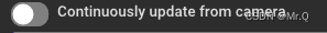
        # 3.5 This is a toggle switch, which is similar to a checkbox. To my way of
        # thinking the difference is subtle: a checkbox toggles properties
        # (for example, purely visual changes like enabling lighting) while a
        # toggle switch is better for changing the behavior of the app (for
        # example, turning on processing from the camera).
        switch = gui.ToggleSwitch("Continuously update from camera")  # 拨动开关
        switch.set_on_clicked(self._on_switch)  # 选中后关联回调: 打印信息
        collapse.add_child(switch)


    def _on_switch(self, is_on):
        if is_on:
            print("Camera would now be running")
        else:
            print("Camera would now be off")
3.6 部件代理WidgetProxy

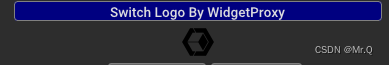
        # 3.6 部件代理. 通过按钮控制部件代理显示不同的图片或者文字.
        self.logo_idx = 0
        proxy = gui.WidgetProxy()  # 部件代理

        def switch_proxy():
            self.logo_idx += 1  # 每次点击会递增
            if self.logo_idx % 3 == 0:
                proxy.set_widget(None)
            elif self.logo_idx % 3 == 1:
                # Add a simple image
                logo = gui.ImageWidget(basedir + "/icon-32.png")
                proxy.set_widget(logo)  # 显示不同的图片
            else:
                label = gui.Label(
                    'Open3D: A Modern Library for 3D Data Processing')
                proxy.set_widget(label)  # 显示不同的文字.
            w.set_needs_layout()

        logo_btn = gui.Button('Switch Logo By WidgetProxy')  # 按钮
        logo_btn.vertical_padding_em = 0
        logo_btn.background_color = gui.Color(r=0, b=0.5, g=0)
        logo_btn.set_on_clicked(switch_proxy)  # 每次点击会调用一次

        collapse.add_child(logo_btn)  # 先添加按钮
        collapse.add_child(proxy)  # 再在按钮下添加部件代理,该部件代理其实就是显示图片或者文字.
3.7 WidgetStack
        # 3.7 Widget stack demo: push_widget(). 动态生成和减少多个部件
        self._widget_idx = 0
        hz = gui.Horiz(spacing=5)  # 水平部件
        push_widget_btn = gui.Button('Push widget')  # 添加部件
        push_widget_btn.vertical_padding_em = 0
        pop_widget_btn = gui.Button('Pop widget')    # 减少部件
        pop_widget_btn.vertical_padding_em = 0

        stack = gui.WidgetStack()  # 生成多个部件
        stack.set_on_top(lambda w: print(f'New widget is: {w.text}'))

        hz.add_child(gui.Label('WidgetStack '))  # 先添加label
        hz.add_child(push_widget_btn)  # 再添加bn
        hz.add_child(pop_widget_btn)   # 再添加bn
        hz.add_child(stack)            # 再添加stack集

        collapse.add_child(hz)

        def push_widget():  # 自定义的,也可以用stack.push_widget()
            self._widget_idx += 1
            stack.push_widget(gui.Label(f'Widget {self._widget_idx}'))  # 压入部件.

        push_widget_btn.set_on_clicked(push_widget)  # 关联生成部件函数,也可以用stack.push_widget()
        pop_widget_btn.set_on_clicked(stack.pop_widget)  # 关联减少部件函数
3.8 列表
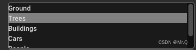
        # 3.8 Add a list of items. 列表
        lv = gui.ListView()
        lv.set_items(["Ground", "Trees", "Buildings", "Cars", "People", "Cats"])
        lv.selected_index = lv.selected_index + 2  # initially is -1, so now 1
        lv.set_max_visible_items(4)
        lv.set_on_selection_changed(self._on_list)  # 当改变选中时触发回调函数. 这里只是打印信息
        collapse.add_child(lv)


    def _on_list(self, new_val, is_dbl_click):
        print(new_val)
3.9 树形视图

        # 3.9 Add a tree view. 树形视图
        tree = gui.TreeView()
        tree.add_text_item(tree.get_root_item(), "Camera")  # 根部添加
        geo_id = tree.add_text_item(tree.get_root_item(), "Geometries")  # 根部添加
        mesh_id = tree.add_text_item(geo_id, "Mesh")  # "Geometries"下再添加
        tree.add_text_item(mesh_id, "Triangles")  # "Mesh"下再添加
        tree.add_text_item(mesh_id, "Albedo texture")
        tree.add_text_item(mesh_id, "Normal map")
        points_id = tree.add_text_item(geo_id, "Points")
        tree.can_select_items_with_children = True
        tree.set_on_selection_changed(self._on_tree)  # 选中时触发回调函数. 这里只是打印信息.
        # does not call on_selection_changed: user did not change selection
        tree.selected_item = points_id  # 默认选中此
        collapse.add_child(tree)


    def _on_tree(self, new_item_id):
        print(new_item_id)
3.10 数字编辑器NumberEdit
        # 3.10 Add two number editors, one for integers and one for floating point
        # Number editor can clamp numbers to a range, although this is more
        # useful for integers than for floating point.
        intedit = gui.NumberEdit(gui.NumberEdit.INT)  # 整数编辑器
        intedit.int_value = 0
        intedit.set_limits(1, 19)  # value coerced to 1
        intedit.int_value = intedit.int_value + 2  # value should be 3
        doubleedit = gui.NumberEdit(gui.NumberEdit.DOUBLE)  # 双精度编辑器

        numlayout = gui.Horiz()
        numlayout.add_child(gui.Label("int"))
        numlayout.add_child(intedit)
        numlayout.add_fixed(em)  # manual spacing (could set it in Horiz() ctor)
        numlayout.add_child(gui.Label("double"))
        numlayout.add_child(doubleedit)
        collapse.add_child(numlayout)
3.11 进度条 ProgressBar
        # 3.11 Create a progress bar. It ranges from 0.0 to 1.0. 进度条
        self._progress = gui.ProgressBar()
        self._progress.value = 0.25  # 25% complete
        self._progress.value = self._progress.value + 0.08  # 0.25 + 0.08 = 33%
        prog_layout = gui.Horiz(em)
        prog_layout.add_child(gui.Label("Progress..."))
        prog_layout.add_child(self._progress)
        collapse.add_child(prog_layout)
3.12 滚动条Slider
        # 3.12 Create a slider. It acts very similar to NumberEdit except that the. 滚动条
        # user moves a slider and cannot type the number.
        slider = gui.Slider(gui.Slider.INT)
        slider.set_limits(5, 13)
        slider.set_on_value_changed(self._on_slider)  # 触发回调函数,这里是改变上面的进度条值.
        collapse.add_child(slider)


    def _on_slider(self, new_val):
        self._progress.value = new_val / 20.0
3.13 文本框
        # 3.13 Create a text editor. The placeholder text (if not empty) will be
        # displayed when there is no text, as concise help, or visible tooltip. 文本框
        tedit = gui.TextEdit()
        tedit.placeholder_text = "Edit me some text here"

        # on_text_changed fires whenever the user changes the text (but not if
        # the text_value property is assigned to).
        tedit.set_on_text_changed(self._on_text_changed)  # 文本框内内容改变时触发回调. 这里是打印文本内容.

        # on_value_changed fires whenever the user signals that they are finished
        # editing the text, either by pressing return or by clicking outside of
        # the text editor, thus losing text focus.
        tedit.set_on_value_changed(self._on_value_changed)
        collapse.add_child(tedit)


    def _on_text_changed(self, new_text):
        print("edit:", new_text)


    def _on_value_changed(self, new_text):
        print("value:", new_text)
3.14 显示3D数组VectorEdit
        # 3.14 Create a widget for showing/editing a 3D vector. 显示3D数组
        vedit = gui.VectorEdit()
        vedit.vector_value = [1, 2, 3]
        vedit.set_on_value_changed(self._on_vedit)  # 内容改变时触发回调. 这里是打印文本内容.
        collapse.add_child(vedit)


    def _on_vedit(self, new_val):
        print(new_val)
3.15 网格布局
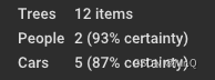
        # 3.15 网格布局. Create a VGrid layout. This layout specifies the number of columns
        # (two, in this case), and will place the first child in the first
        # column, the second in the second, the third in the first, the fourth
        # in the second, etc.
        # So:
        #      2 cols             3 cols                  4 cols
        #   |  1  |  2  |   |  1  |  2  |  3  |   |  1  |  2  |  3  |  4  |
        #   |  3  |  4  |   |  4  |  5  |  6  |   |  5  |  6  |  7  |  8  |
        #   |  5  |  6  |   |  7  |  8  |  9  |   |  9  | 10  | 11  | 12  |
        #   |    ...    |   |       ...       |   |         ...           |
        vgrid = gui.VGrid(2)  # 两列
        vgrid.add_child(gui.Label("Trees"))  # 一行一行添加
        vgrid.add_child(gui.Label("12 items"))
        vgrid.add_child(gui.Label("People"))
        vgrid.add_child(gui.Label("2 (93% certainty)"))
        vgrid.add_child(gui.Label("Cars"))
        vgrid.add_child(gui.Label("5 (87% certainty)"))
        collapse.add_child(vgrid)
3.16 选项卡TabControl

        # 3.16 选项卡控件. Create a tab control. This is really a set of N layouts on top of each
        # other, but with only one selected.
        tabs = gui.TabControl()  # 下面会依次创建4个选项

        tab1 = gui.Vert()  # 第一个选项管理的是一个垂直布局.
        tab1.add_child(gui.Checkbox("Enable option 1"))  # 每一个都是Checkbox
        tab1.add_child(gui.Checkbox("Enable option 2"))
        tab1.add_child(gui.Checkbox("Enable option 3"))
        tabs.add_tab("Options", tab1)

        tab2 = gui.Vert()  # 一个垂直布局.
        tab2.add_child(gui.Label("No plugins detected"))
        tab2.add_stretch()
        tabs.add_tab("Plugins", tab2)

        tab3 = gui.RadioButton(gui.RadioButton.VERT)  # 创建单选按钮, 按钮按垂直排列VERT
        tab3.set_items(["Apple", "Orange"])
        def vt_changed(idx):
            print(f"current cargo: {tab3.selected_value}")
        tab3.set_on_selection_changed(vt_changed)  # 内容改变时触发回调. 这里是打印文本
        tabs.add_tab("Cargo", tab3)

        tab4 = gui.RadioButton(gui.RadioButton.HORIZ)  # 创建单选按钮, 按钮按水平排列HORIZ
        tab4.set_items(["Air plane", "Train", "Bus"])
        def hz_changed(idx):
            print(f"current traffic plan: {tab4.selected_value}")
        tab4.set_on_selection_changed(hz_changed)  # 内容改变时触发回调. 这里是打印文本
        tabs.add_tab("Traffic", tab4)
        collapse.add_child(tabs)
3.17 终止程序
gui.Application.instance.quit()
        # 3.17 Quit button. (Typically this is a menu item)  关闭应用按钮
        button_layout = gui.Horiz()
        ok_button = gui.Button("Ok")
        ok_button.set_on_clicked(self._on_ok)  # 触发回调,关闭
        button_layout.add_stretch()  # 添加一个拉伸空白空间
        button_layout.add_child(ok_button)  #

        layout.add_child(button_layout)

        # We're done, set the window's layout
        w.add_child(layout)


    def _on_ok(self):
        gui.Application.instance.quit()
4. 完整程序
import open3d.visualization.gui as gui
import os.path

basedir = os.path.dirname(os.path.realpath(__file__))


class ExampleWindow:
    MENU_CHECKABLE = 1
    MENU_DISABLED = 2
    MENU_QUIT = 3

    def __init__(self):
        self.window = gui.Application.instance.create_window("Test", 400, 768)
        # self.window = gui.Application.instance.create_window("Test", 400, 768,
        #                                                        x=50, y=100)
        w = self.window  # for more concise code

        # Rather than specifying sizes in pixels, which may vary in size based
        # on the monitor, especially on macOS which has 220 dpi monitors, use
        # the em-size. This way sizings will be proportional to the font size,
        # which will create a more visually consistent size across platforms.
        em = w.theme.font_size

        # Widgets are laid out in layouts: gui.Horiz, gui.Vert,
        # gui.CollapsableVert, and gui.VGrid. By nesting the layouts we can
        # achieve complex designs. Usually we use a vertical layout as the
        # topmost widget, since widgets tend to be organized from top to bottom.
        # Within that, we usually have a series of horizontal layouts for each
        # row.
        # 部件通常是垂直布局,然后部件内部是行布局.
        layout = gui.Vert(0, gui.Margins(0.5 * em, 0.5 * em, 0.5 * em,
                                         0.5 * em))  # 这里选垂直布局Vert. em=w.theme.font_size

        # 1, Create the menu. The menu is global (because the macOS menu is global),
        # so only create it once.
        if gui.Application.instance.menubar is None:
            menubar = gui.Menu()  # 菜单栏
            test_menu = gui.Menu()  # 添加第一个菜单
            test_menu.add_item("An option", ExampleWindow.MENU_CHECKABLE)  # 关联数字1 MENU_CHECKABLE
            test_menu.set_checked(ExampleWindow.MENU_CHECKABLE, True)  # 关联数字1 是否选中

            test_menu.add_item("Unavailable feature", ExampleWindow.MENU_DISABLED)  # 关联数字2 MENU_DISABLED
            test_menu.set_enabled(ExampleWindow.MENU_DISABLED, False)  # 关联数字2 是否开启该item.

            test_menu.add_separator()
            test_menu.add_item("Quit", ExampleWindow.MENU_QUIT)
            # On macOS the first menu item is the application menu item and will
            # always be the name of the application (probably "Python"),
            # regardless of what you pass in here. The application menu is
            # typically where About..., Preferences..., and Quit go.
            menubar.add_menu("Test", test_menu)
            gui.Application.instance.menubar = menubar

        # Each window needs to know what to do with the menu items, so we need
        # to tell the window how to handle menu items.
        # item关联回调函数
        w.set_on_menu_item_activated(ExampleWindow.MENU_CHECKABLE,  # menubar.set_checked
                                     self._on_menu_checkable)
        w.set_on_menu_item_activated(ExampleWindow.MENU_QUIT,  # 关停整个app
                                     self._on_menu_quit)

        # 2, Create a file-chooser widget. One part will be a text edit widget for
        # the filename and clicking on the button will let the user choose using
        # the file dialog.
        # 文件选择部件. 选中按钮将会展示目录
        self._fileedit = gui.TextEdit()    # 生成文本框
        filedlgbutton = gui.Button("...")  # 生成选择文件按钮
        filedlgbutton.horizontal_padding_em = 0.5  # em是相对度量单位. 以em为单位的水平填充
        filedlgbutton.vertical_padding_em = 0
        filedlgbutton.set_on_clicked(self._on_filedlg_button)  # 按钮关联回调函数

        # (Create the horizontal widget for the row. This will make sure the
        # text editor takes up as much space as it can.)
        fileedit_layout = gui.Horiz()  # 水平布局
        fileedit_layout.add_child(gui.Label("Model file"))  # 水平布局内先添加一个Label
        fileedit_layout.add_child(self._fileedit)  # 添加一个文本框
        fileedit_layout.add_fixed(0.25 * em)  # 在布局中添加固定数量的空白空间. em=w.theme.font_size
        fileedit_layout.add_child(filedlgbutton)  # 再添加按钮
        # add to the top-level (vertical) layout
        layout.add_child(fileedit_layout)

        # 3, Create a collapsible vertical widget, which takes up enough vertical
        # space for all its children when open, but only enough for text when
        # closed. This is useful for property pages, so the user can hide sets
        # of properties they rarely use. All layouts take a spacing parameter,
        # which is the spacinging between items in the widget, and a margins
        # parameter, which specifies the spacing of the left, top, right,
        # bottom margins. (This acts like the 'padding' property in CSS.)
        collapse = gui.CollapsableVert("Widgets", 0.33 * em,
                                       gui.Margins(em, 0, 0, 0))  # 生成一个可折叠的垂直部件.
        # 3.1 label
        self._label = gui.Label("this is a Label")  # 生成一个label
        self._label.text_color = gui.Color(1.0, 0.5, 0.0)  # 设置label颜色
        collapse.add_child(self._label)

        # 3.2 Create a checkbox. Checking or unchecking would usually be used to set
        # a binary property, but in this case it will show a simple message box,
        # which illustrates how to create simple dialogs.
        cb = gui.Checkbox("Enable some really cool effect")
        cb.set_on_checked(self._on_cb)  # set the callback function: 可实现一些回调功能
        collapse.add_child(cb)

        # 3.3 Create a color editor. We will change the color of the orange label
        # above when the color changes.  色板
        color = gui.ColorEdit()
        color.color_value = self._label.text_color  # 设置初值颜色
        color.set_on_value_changed(self._on_color)  # 选中后关联回调功能, 这里的回调功能是修改_label颜色
        collapse.add_child(color)

        # 3.4 This is a combobox, nothing fancy here, just set a simple function to
        # handle the user selecting an item. 下拉框
        combo = gui.Combobox()  # 下拉框
        combo.add_item("Show point labels")
        combo.add_item("Show point velocity")
        combo.add_item("Show bounding boxes")
        combo.set_on_selection_changed(self._on_combo)  # 选中后关联回调: 打印信息
        collapse.add_child(combo)

        # 3.5 This is a toggle switch, which is similar to a checkbox. To my way of
        # thinking the difference is subtle: a checkbox toggles properties
        # (for example, purely visual changes like enabling lighting) while a
        # toggle switch is better for changing the behavior of the app (for
        # example, turning on processing from the camera).
        switch = gui.ToggleSwitch("Continuously update from camera")  # 拨动开关
        switch.set_on_clicked(self._on_switch)  # 选中后关联回调: 打印信息
        collapse.add_child(switch)

        # 3.6 部件代理. 通过按钮控制部件代理显示不同的图片或者文字.
        self.logo_idx = 0
        proxy = gui.WidgetProxy()  # 部件代理

        def switch_proxy():
            self.logo_idx += 1  # 每次点击会递增
            if self.logo_idx % 3 == 0:
                proxy.set_widget(None)
            elif self.logo_idx % 3 == 1:
                # Add a simple image
                logo = gui.ImageWidget(basedir + "/icon-32.png")
                proxy.set_widget(logo)  # 显示不同的图片
            else:
                label = gui.Label(
                    'Open3D: A Modern Library for 3D Data Processing')
                proxy.set_widget(label)  # 显示不同的文字.
            w.set_needs_layout()

        logo_btn = gui.Button('Switch Logo By WidgetProxy')  # 按钮
        logo_btn.vertical_padding_em = 0
        logo_btn.background_color = gui.Color(r=0, b=0.5, g=0)
        logo_btn.set_on_clicked(switch_proxy)  # 每次点击会调用一次

        collapse.add_child(logo_btn)  # 先添加按钮
        collapse.add_child(proxy)  # 再在按钮下添加部件代理,该部件代理其实就是显示图片或者文字.

        # 3.7 Widget stack demo: push_widget(). 动态生成和减少多个部件
        self._widget_idx = 0
        hz = gui.Horiz(spacing=5)  # 水平部件
        push_widget_btn = gui.Button('Push widget')  # 添加部件
        push_widget_btn.vertical_padding_em = 0
        pop_widget_btn = gui.Button('Pop widget')    # 减少部件
        pop_widget_btn.vertical_padding_em = 0

        stack = gui.WidgetStack()  # 生成多个部件
        stack.set_on_top(lambda w: print(f'New widget is: {w.text}'))

        hz.add_child(gui.Label('WidgetStack '))  # 先添加label
        hz.add_child(push_widget_btn)  # 再添加bn
        hz.add_child(pop_widget_btn)   # 再添加bn
        hz.add_child(stack)            # 再添加stack集

        collapse.add_child(hz)

        def push_widget():  # 自定义的,也可以用stack.push_widget()
            self._widget_idx += 1
            stack.push_widget(gui.Label(f'Widget {self._widget_idx}'))  # 压入部件.

        push_widget_btn.set_on_clicked(push_widget)  # 关联生成部件函数,也可以用stack.push_widget()
        pop_widget_btn.set_on_clicked(stack.pop_widget)  # 关联减少部件函数

        # 3.8 Add a list of items. 列表
        lv = gui.ListView()
        lv.set_items(["Ground", "Trees", "Buildings", "Cars", "People", "Cats"])
        lv.selected_index = lv.selected_index + 2  # initially is -1, so now 1
        lv.set_max_visible_items(4)
        lv.set_on_selection_changed(self._on_list)  # 当改变选中时触发回调函数. 这里只是打印信息
        collapse.add_child(lv)

        # 3.9 Add a tree view. 树形视图
        tree = gui.TreeView()
        tree.add_text_item(tree.get_root_item(), "Camera")  # 根部添加
        geo_id = tree.add_text_item(tree.get_root_item(), "Geometries")  # 根部添加
        mesh_id = tree.add_text_item(geo_id, "Mesh")  # "Geometries"下再添加
        tree.add_text_item(mesh_id, "Triangles")  # "Mesh"下再添加
        tree.add_text_item(mesh_id, "Albedo texture")
        tree.add_text_item(mesh_id, "Normal map")
        points_id = tree.add_text_item(geo_id, "Points")
        tree.can_select_items_with_children = True
        tree.set_on_selection_changed(self._on_tree)  # 选中时触发回调函数. 这里只是打印信息.
        # does not call on_selection_changed: user did not change selection
        tree.selected_item = points_id  # 默认选中此
        collapse.add_child(tree)

        # 3.10 Add two number editors, one for integers and one for floating point
        # Number editor can clamp numbers to a range, although this is more
        # useful for integers than for floating point.
        intedit = gui.NumberEdit(gui.NumberEdit.INT)  # 整数编辑器
        intedit.int_value = 0
        intedit.set_limits(1, 19)  # value coerced to 1
        intedit.int_value = intedit.int_value + 2  # value should be 3
        doubleedit = gui.NumberEdit(gui.NumberEdit.DOUBLE)  # 双精度编辑器

        numlayout = gui.Horiz()
        numlayout.add_child(gui.Label("int"))
        numlayout.add_child(intedit)
        numlayout.add_fixed(em)  # manual spacing (could set it in Horiz() ctor)
        numlayout.add_child(gui.Label("double"))
        numlayout.add_child(doubleedit)
        collapse.add_child(numlayout)

        # 3.11 Create a progress bar. It ranges from 0.0 to 1.0. 进度条
        self._progress = gui.ProgressBar()
        self._progress.value = 0.25  # 25% complete
        self._progress.value = self._progress.value + 0.08  # 0.25 + 0.08 = 33%
        prog_layout = gui.Horiz(em)
        prog_layout.add_child(gui.Label("Progress..."))
        prog_layout.add_child(self._progress)
        collapse.add_child(prog_layout)

        # 3.12 Create a slider. It acts very similar to NumberEdit except that the. 滚动条
        # user moves a slider and cannot type the number.
        slider = gui.Slider(gui.Slider.INT)
        slider.set_limits(5, 13)
        slider.set_on_value_changed(self._on_slider)  # 触发回调函数,这里是改变上面的进度条值.
        collapse.add_child(slider)

        # 3.13 Create a text editor. The placeholder text (if not empty) will be
        # displayed when there is no text, as concise help, or visible tooltip. 文本框
        tedit = gui.TextEdit()
        tedit.placeholder_text = "Edit me some text here"

        # on_text_changed fires whenever the user changes the text (but not if
        # the text_value property is assigned to).
        tedit.set_on_text_changed(self._on_text_changed)  # 文本框内内容改变时触发回调. 这里是打印文本内容.

        # on_value_changed fires whenever the user signals that they are finished
        # editing the text, either by pressing return or by clicking outside of
        # the text editor, thus losing text focus.
        tedit.set_on_value_changed(self._on_value_changed)
        collapse.add_child(tedit)

        # 3.14 Create a widget for showing/editing a 3D vector. 显示3D数组
        vedit = gui.VectorEdit()
        vedit.vector_value = [1, 2, 3]
        vedit.set_on_value_changed(self._on_vedit)  # 内容改变时触发回调. 这里是打印文本内容.
        collapse.add_child(vedit)

        # 3.15 网格布局. Create a VGrid layout. This layout specifies the number of columns
        # (two, in this case), and will place the first child in the first
        # column, the second in the second, the third in the first, the fourth
        # in the second, etc.
        # So:
        #      2 cols             3 cols                  4 cols
        #   |  1  |  2  |   |  1  |  2  |  3  |   |  1  |  2  |  3  |  4  |
        #   |  3  |  4  |   |  4  |  5  |  6  |   |  5  |  6  |  7  |  8  |
        #   |  5  |  6  |   |  7  |  8  |  9  |   |  9  | 10  | 11  | 12  |
        #   |    ...    |   |       ...       |   |         ...           |
        vgrid = gui.VGrid(2)  # 两列
        vgrid.add_child(gui.Label("Trees"))  # 一行一行添加
        vgrid.add_child(gui.Label("12 items"))
        vgrid.add_child(gui.Label("People"))
        vgrid.add_child(gui.Label("2 (93% certainty)"))
        vgrid.add_child(gui.Label("Cars"))
        vgrid.add_child(gui.Label("5 (87% certainty)"))
        collapse.add_child(vgrid)

        # 3.16 选项卡控件. Create a tab control. This is really a set of N layouts on top of each
        # other, but with only one selected.
        tabs = gui.TabControl()  # 下面会依次创建4个选项

        tab1 = gui.Vert()  # 第一个选项管理的是一个垂直布局.
        tab1.add_child(gui.Checkbox("Enable option 1"))  # 每一个都是Checkbox
        tab1.add_child(gui.Checkbox("Enable option 2"))
        tab1.add_child(gui.Checkbox("Enable option 3"))
        tabs.add_tab("Options", tab1)

        tab2 = gui.Vert()  # 一个垂直布局.
        tab2.add_child(gui.Label("No plugins detected"))
        tab2.add_stretch()
        tabs.add_tab("Plugins", tab2)

        tab3 = gui.RadioButton(gui.RadioButton.VERT)  # 创建单选按钮, 按钮按垂直排列VERT
        tab3.set_items(["Apple", "Orange"])
        def vt_changed(idx):
            print(f"current cargo: {tab3.selected_value}")
        tab3.set_on_selection_changed(vt_changed)  # 内容改变时触发回调. 这里是打印文本
        tabs.add_tab("Cargo", tab3)

        tab4 = gui.RadioButton(gui.RadioButton.HORIZ)  # 创建单选按钮, 按钮按水平排列HORIZ
        tab4.set_items(["Air plane", "Train", "Bus"])
        def hz_changed(idx):
            print(f"current traffic plan: {tab4.selected_value}")
        tab4.set_on_selection_changed(hz_changed)  # 内容改变时触发回调. 这里是打印文本
        tabs.add_tab("Traffic", tab4)
        collapse.add_child(tabs)

        layout.add_child(collapse)

        # 3.17 Quit button. (Typically this is a menu item)  关闭应用按钮
        button_layout = gui.Horiz()
        ok_button = gui.Button("Ok")
        ok_button.set_on_clicked(self._on_ok)  # 触发回调,关闭
        button_layout.add_stretch()  # 添加一个拉伸空白空间
        button_layout.add_child(ok_button)  #

        layout.add_child(button_layout)

        # We're done, set the window's layout
        w.add_child(layout)

    def _on_filedlg_button(self):  # 选择文件按钮
        filedlg = gui.FileDialog(gui.FileDialog.OPEN, "Select file",
                                 self.window.theme)
        filedlg.add_filter(".obj .ply .stl", "Triangle mesh (.obj, .ply, .stl)")  # 过滤条件, 提示说明文本.
        filedlg.add_filter("", "All files")  # 过滤条件为空,即不过滤.
        filedlg.set_on_cancel(self._on_filedlg_cancel)
        filedlg.set_on_done(self._on_filedlg_done)
        self.window.show_dialog(filedlg)

    def _on_filedlg_cancel(self):
        self.window.close_dialog()

    def _on_filedlg_done(self, path):
        self._fileedit.text_value = path
        self.window.close_dialog()

    def _on_cb(self, is_checked):
        if is_checked:
            text = "Sorry, effects are unimplemented"
        else:
            text = "Good choice"

        self.show_message_dialog("There might be a problem...", text)

    def _on_switch(self, is_on):
        if is_on:
            print("Camera would now be running")
        else:
            print("Camera would now be off")

    # This function is essentially the same as window.show_message_box(),
    # so for something this simple just use that, but it illustrates making a
    # dialog.
    def show_message_dialog(self, title, message):
        # A Dialog is just a widget, so you make its child a layout just like
        # a Window.
        dlg = gui.Dialog(title)

        # Add the message text
        em = self.window.theme.font_size
        dlg_layout = gui.Vert(em, gui.Margins(em, em, em, em))
        dlg_layout.add_child(gui.Label(message))

        # Add the Ok button. We need to define a callback function to handle
        # the click.
        ok_button = gui.Button("Ok")
        ok_button.set_on_clicked(self._on_dialog_ok)

        # We want the Ok button to be an the right side, so we need to add
        # a stretch item to the layout, otherwise the button will be the size
        # of the entire row. A stretch item takes up as much space as it can,
        # which forces the button to be its minimum size.
        button_layout = gui.Horiz()
        button_layout.add_stretch()
        button_layout.add_child(ok_button)

        # Add the button layout,
        dlg_layout.add_child(button_layout)
        # ... then add the layout as the child of the Dialog
        dlg.add_child(dlg_layout)
        # ... and now we can show the dialog
        self.window.show_dialog(dlg)

    def _on_dialog_ok(self):
        self.window.close_dialog()

    def _on_color(self, new_color):
        self._label.text_color = new_color

    def _on_combo(self, new_val, new_idx):
        print(new_idx, new_val)

    def _on_list(self, new_val, is_dbl_click):
        print(new_val)

    def _on_tree(self, new_item_id):
        print(new_item_id)

    def _on_slider(self, new_val):
        self._progress.value = new_val / 20.0

    def _on_text_changed(self, new_text):
        print("edit:", new_text)

    def _on_value_changed(self, new_text):
        print("value:", new_text)

    def _on_vedit(self, new_val):
        print(new_val)

    def _on_ok(self):
        gui.Application.instance.quit()

    def _on_menu_checkable(self):
        gui.Application.instance.menubar.set_checked(
            ExampleWindow.MENU_CHECKABLE,
            not gui.Application.instance.menubar.is_checked(
                ExampleWindow.MENU_CHECKABLE))

    def _on_menu_quit(self):
        gui.Application.instance.quit()


# This class is essentially the same as window.show_message_box(),
# so for something this simple just use that, but it illustrates making a
# dialog.
class MessageBox:

    def __init__(self, title, message):
        self._window = None

        # A Dialog is just a widget, so you make its child a layout just like
        # a Window.
        dlg = gui.Dialog(title)

        # Add the message text
        em = self.window.theme.font_size
        dlg_layout = gui.Vert(em, gui.Margins(em, em, em, em))
        dlg_layout.add_child(gui.Label(message))

        # Add the Ok button. We need to define a callback function to handle
        # the click.
        ok_button = gui.Button("Ok")
        ok_button.set_on_clicked(self._on_ok)

        # We want the Ok button to be an the right side, so we need to add
        # a stretch item to the layout, otherwise the button will be the size
        # of the entire row. A stretch item takes up as much space as it can,
        # which forces the button to be its minimum size.
        button_layout = gui.Horiz()
        button_layout.add_stretch()
        button_layout.add_child(ok_button)

        # Add the button layout,
        dlg_layout.add_child(button_layout)
        # ... then add the layout as the child of the Dialog
        dlg.add_child(dlg_layout)

    def show(self, window):
        self._window = window

    def _on_ok(self):
        self._window.close_dialog()


def main():
    # We need to initialize the application, which finds the necessary shaders for
    # rendering and prepares the cross-platform window abstraction.
    gui.Application.instance.initialize()

    w = ExampleWindow()

    # Run the event loop. This will not return until the last window is closed.
    gui.Application.instance.run()


if __name__ == "__main__":
    main()


