最近在做大屏数据展示,样式真的超级好看。但是细节处理也是比较麻烦的。
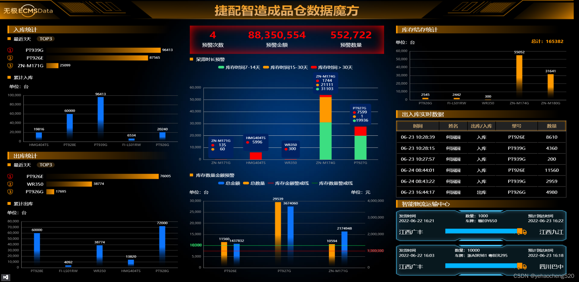
最终效果图如下:
下面对我遇到的几个知识点进行汇总:
1. 横向的柱状图——设置yAxis的type为category即可
var option = {
   title: {
       text: ''
   },
   tooltip: {
       trigger: 'axis',
       axisPointer: {
           type: 'shadow'
       }
   },
   grid: {
       left: '-80',
       right: '40',
       bottom: '0',
       top: '10',
       containLabel: true
   },
   xAxis: {
       type: 'value',
       show: false,
       boundaryGap: [0, 0.01]
   },
   yAxis: {
       type: 'category',
       show: false,
   },
   series: [
       {
           name: '',
           type: 'bar',
           data: data,
           color: new echarts.graphic.LinearGradient(0, 0, 1, 0, [
               {
                   offset: 0,
                   color: 'transparent'
               },
               {
                   offset: 1,
                   color: '#f90'
               }
           ]),
           label: {
               normal: {
                   show: true,
                   position: 'right',
                   formatter: '{c}',
                   color: '#fff'
               }
           },
           barWidth: 20,
       }
   ]
};
dom.setOption(option);
下面详细解析:
1.1 标题——title
title: {
   text: '',//主标题
   subText:'',//副标题
},
1.2 输入移入的效果——tooltip
下面是最简单的效果了,如果需要复杂的效果,需要单独设置
tooltip: {
    trigger: 'axis',
    axisPointer: {
        type: 'shadow'
    }
},
1.3 网格的间距——grid
grid: {
    left: '-80',
    right: '40',
    bottom: '0',
    top: '10',
    containLabel: true
},
1.4 X轴:隐藏坐标轴——xAxis
xAxis: {
    type: 'value',
    show: false,//隐藏x轴
    boundaryGap: [0, 0.01]
},
1.5 Y轴:设置横向柱状图样式并隐藏坐标轴——yAxis
yAxis: {
    type: 'category',
    show: false,
},
1.6 渐变色:设置series中的color参数即可
series: [
    {
        name: '',
        type: 'bar',
        data: data,
        color: new echarts.graphic.LinearGradient(0, 0, 1, 0, [
            {
                offset: 0,
                color: 'transparent'
            },
            {
                offset: 1,
                color: '#f90'
            }
        ]),
        label: {
            normal: {
                show: true,
                position: 'right',
                formatter: '{c}',
                color: '#fff'
            }
        },
        barWidth: 20,
    }
]
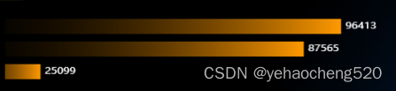
最终效果图:
2. 堆叠柱状图——设置series中的stack: 'xxxx'即可
堆叠柱状图:只要series中的stack参数一样,则就可以自动堆叠在一起
2.1 实现堆叠效果
注意:下面代码中的data和color都是数组或者对象,因为要实现堆叠效果,则至少要有两组数据才可以。
比如现在的data格式如下:
data:{
	'7-14天':[11,22,33,44,55,66,77,88],
	'15-30天':[111,222,333,444,555,666,777,888],
	'>30天':[1111,2222,3333,4444,5555,6666,7777,8888]
}
for(let key in data){
	series.push({
	   name: key,
	   data: data[key],
	   type: 'bar',
	   color: color[key],
	   stack: 'total',
	   barWidth: 40,
	})
}
上面的效果就可以实现堆叠了,但是如果要实现如效果图中的label上下摆放展示的话,则需要用下面的方式来处理
2.2 label的自定义处理——formatter和rich的处理
label:{
  normal: {
      show: key == 2 ? true : false,
      position: 'top',
      color:'#fff',
      formatter: function (val) {
          let html = `${val.name}\n`;
          if (val.value) {
              html += `{fourIcon|}{four|${val.value}}\n`;
          }
          if (data[1][val.dataIndex]) {
              html += `{twoIcon|}{two|${data[1][val.dataIndex]}}\n`
          }
          if (data[0][val.dataIndex]) {
              html += `{oneIcon|}{one|${data[0][val.dataIndex]}}`
          }
          return html;
      },
      lineHeight: 16,
      backgroundColor: '#002262',
      padding: 10,
      borderRadius: 6,
      rich: {
          one: { color: '#fff', align: 'center', fontSize: 14,},
          two: { color: '#fff', align: 'center',fontSize:14 },
          three: { color: '#fff', align: 'center', fontSize:14 },
          four: { color: '#fff', align: 'center', fontSize: 14 },
          oneIcon: {
              height: 10,
              align: 'left',
              width: 10,
              borderRadius: 10,
              backgroundColor: '#3CDE81',
              margin: [0,10],
          },
          twoIcon: {
              height: 10,
              align: 'left',
              width: 10,
              borderRadius: 10,
              backgroundColor: '#f90',
              margin: [0, 10],
          },
          fourIcon: {
              height: 10,
              align: 'left',
              width: 10,
              borderRadius: 10,
              backgroundColor: '#f00',
              margin: [0, 10],
          }
      }
  }
},
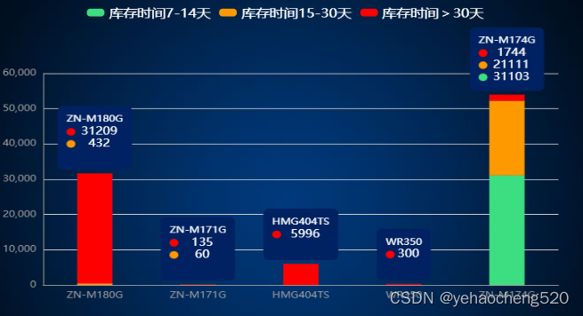
3.警戒线——markLine的使用及双坐标轴的处理
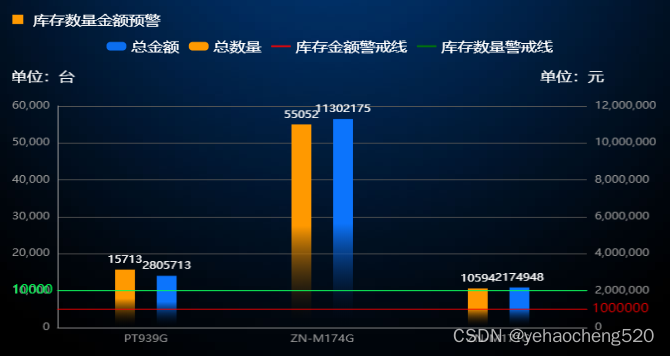
3.1 双坐标轴 需要通过yAxisIndex来设置
一般双坐标轴的话,需要yAxis和series都是数组的形式。然后在series中指定yAxisIndex为对应yAxis的索引即可。
我这边是循环遍历的数组,所以部分代码如下:
series.push({
  name: legend ? legend[index] : '',
  data: item,
  type: num ? 'bar' : (index < 2 ? 'bar' : 'line'),
  yAxisIndex: index,
  barGap: 1.1,
  color: new echarts.graphic.LinearGradient(0, 1, 0, 0, [
      {
          offset: 0,
          color: 'transparent'
      },
      {
          offset: 0.5,
          color: color[index]
      }
  ]),
  markLine: markLineArr && index == 0 ? {
      symbol: 'none',
      data: [
          { yAxis: markLineArr[0], lineStyle: { color: '#00FF55', type: 'solid' }, label: { color: '#00FF55', fontSize: 14, position: 'start' } }]
  } : (markLineArr && index == 1 ? {
      symbol: 'none',
      data: [
          { yAxis: markLineArr[1], lineStyle: { color: '#FF0000', type: 'solid' }, label: { color: '#FF0000', fontSize: 14, position: 'end' } }]
  } : {}),
  label: {
      normal: {
          show: true,
          position: 'top',
          formatter: '{c}',
          color: '#fff'
      }
  },
  symbol: 'none',
  smooth: true,
  barWidth: 20,
})
3.2 警戒线markLine的处理方法
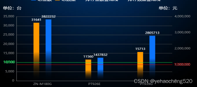
如上的效果图:左侧坐标轴对应一条警戒线,绿色。右侧坐标轴对应一条警戒线,红色,因此需要单独判断并对颜色样式进行处理。
markLine: markLineArr && index == 0 ? {
    symbol: 'none',
    data: [
        { yAxis: markLineArr[0], lineStyle: { color: '#00FF55', type: 'solid' }, label: { color: '#00FF55', fontSize: 14, position: 'start' } }]
} : (markLineArr && index == 1 ? {
    symbol: 'none',
    data: [
        { yAxis: markLineArr[1], lineStyle: { color: '#FF0000', type: 'solid' }, label: { color: '#FF0000', fontSize: 14, position: 'end' } }]
} : {}),
4.动态轮播数据——一条一条的轮播展示
setInterval(function () {
  xAxis.shift();
  data.forEach((item, index) => {
      item.shift();
  })
  sum += 1;
  if (xAxisArr[sum]) {
      xAxis.push(xAxisArr[sum])
      data.forEach((item, index) => {
          item.push(
              dataArr[index][sum]
          );
      })
  } else {
      sum = 0;
      xAxis.push(xAxisArr[sum])
      data.forEach((item, index) => {
          item.push(
              dataArr[index][sum]
          );
      })
  }
  let series = [];
  data.forEach(item => {
      series.push({
          data: item
      })
  })
  dom.setOption({
      xAxis: {
          data: xAxis
      },
      series: series
  });
}, 10000);
间隔一定时间,series和xAxis的数据,开头shift()删除一项,后面push添加一项,然后通过setOption来设置,就会实现动态轮播的效果,按说一次轮播多条也是可以的,但是我这边没有实现,二维数组搞得我有点懵。
5.table表格中的单元格回根据内容的多少进行撑开,禁止撑开的方法
table{
	width: 100%;
    table-layout:fixed;
}
完成!!!


