可设置圆角背景边框的的按钮, 通过调节色彩明度自动计算按下(pressed)状态颜色
使用:
xml
<?xml version="1.0" encoding="UTF-8"?>
<LinearLayout android:paddingTop="20dp" android:orientation="vertical" android:layout_height="match_parent" android:layout_width="match_parent" xmlns:app="http://schemas.android.com/apk/res-auto" xmlns:android="http://schemas.android.com/apk/res/android">
<LinearLayout android:orientation="horizontal" android:layout_height="wrap_content" android:layout_width="match_parent">
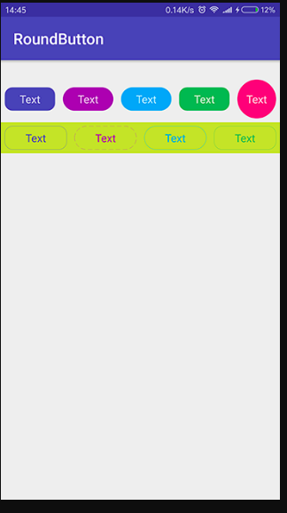
<com.github.czy1121.view.RoundButton app:btnSolidColor="#3F51B5" app:btnPressedRatio="0.8" app:btnCornerRadius="10dp" android:text="Text" style="@style/RoundButton"/>
<com.github.czy1121.view.RoundButton app:btnSolidColor="#9C27B0" app:btnPressedRatio="0.8" app:btnCornerRadius="stadium" android:text="Text" style="@style/RoundButton"/>
<com.github.czy1121.view.RoundButton app:btnSolidColor="#03A9F4" app:btnPressedRatio="0.8" app:btnCornerRadius="stadium" android:text="Text" style="@style/RoundButton"/>
<com.github.czy1121.view.RoundButton app:btnSolidColor="#4CAF50" app:btnPressedRatio="0.9" app:btnCornerRadius="10dp" android:text="Text" style="@style/RoundButton" android:enabled="false"/>
<com.github.czy1121.view.RoundButton android:layout_height="50dp" android:layout_width="50dp" app:btnSolidColor="@color/bg" app:btnPressedRatio="0.9" app:btnCornerRadius="stadium" android:text="Text" style="@style/RoundButton" android:layout_weight="0"/>
</LinearLayout>
<LinearLayout android:orientation="horizontal" android:layout_height="wrap_content" android:layout_width="match_parent" android:background="#CDDC39">
<com.github.czy1121.view.RoundButton app:btnPressedRatio="1.5" app:btnCornerRadius="10dp" android:text="Text" style="@style/RoundButton.Two" app:btnStrokeColor="#3F51B5" android:textColor="#3F51B5"/>
<com.github.czy1121.view.RoundButton app:btnPressedRatio="0.5" app:btnCornerRadius="stadium" android:text="Text" style="@style/RoundButton.Two" app:btnStrokeColor="#9C27B0" android:textColor="#9C27B0" app:btnStrokeDashWidth="6dp" app:btnStrokeDashGap="3dp"/>
<com.github.czy1121.view.RoundButton app:btnPressedRatio="0.9" app:btnCornerRadius="stadium" android:text="Text" style="@style/RoundButton.Two" app:btnStrokeColor="#03A9F4" android:textColor="#03A9F4"/>
<com.github.czy1121.view.RoundButton app:btnPressedRatio="0.9" app:btnCornerRadius="10dp" android:text="Text" style="@style/RoundButton.Two" app:btnStrokeColor="#4CAF50" android:textColor="#4CAF50"/>
</LinearLayout>
</LinearLayout>
import android.content.Context;
import android.content.res.ColorStateList;
import android.content.res.TypedArray;
import android.graphics.Color;
import android.graphics.Rect;
import android.graphics.RectF;
import android.graphics.drawable.GradientDrawable;
import android.util.AttributeSet;
import android.view.Gravity;
import android.widget.TextView;

import com.github.czy1121.roundbutton.R;


public final class RoundButton extends TextView {
    public RoundButton(Context context) {
        this(context, null);
    }

    public RoundButton(Context context, AttributeSet attrs) {
        this(context, attrs, 0);
    }

    public RoundButton(Context context, AttributeSet attrs, int defStyle) {
        super(context, attrs, defStyle);


        TypedArray a = context.obtainStyledAttributes(attrs, R.styleable.RoundButton);

        float pressedRatio = a.getFloat(R.styleable.RoundButton_btnPressedRatio, 0.80f);
        int cornerRadius = a.getLayoutDimension(R.styleable.RoundButton_btnCornerRadius, 0);

        ColorStateList solidColor = a.getColorStateList(R.styleable.RoundButton_btnSolidColor);
        int strokeColor = a.getColor(R.styleable.RoundButton_btnStrokeColor, 0x0);
        int strokeWidth = a.getDimensionPixelSize(R.styleable.RoundButton_btnStrokeWidth, 0);
        int strokeDashWidth = a.getDimensionPixelSize(R.styleable.RoundButton_btnStrokeDashWidth, 0);
        int strokeDashGap = a.getDimensionPixelSize(R.styleable.RoundButton_btnStrokeDashGap, 0);

        a.recycle();

        setSingleLine(true);
        setGravity(Gravity.CENTER);

        RoundDrawable rd = new RoundDrawable(cornerRadius == -1);
        rd.setCornerRadius(cornerRadius == -1 ? 0 : cornerRadius);
        rd.setStroke(strokeWidth, strokeColor, strokeDashWidth, strokeDashGap);

        if (solidColor == null) {
            solidColor = ColorStateList.valueOf(0);
        }
        if (solidColor.isStateful()) {
            rd.setSolidColors(solidColor);
        } else if (pressedRatio > 0.0001f) {
            rd.setSolidColors(csl(solidColor.getDefaultColor(), pressedRatio));
        } else {
            rd.setColor(solidColor.getDefaultColor());
        }
        setBackground(rd);
    }

    // 灰度
    int greyer(int color) {
        int blue = (color & 0x000000FF) >> 0;
        int green = (color & 0x0000FF00) >> 8;
        int red = (color & 0x00FF0000) >> 16;
        int grey = Math.round(red * 0.299f + green * 0.587f + blue * 0.114f);
        return Color.argb(0xff, grey, grey, grey);
    }

    // 明度
    int darker(int color, float ratio) {
        color = (color >> 24) == 0 ? 0x22808080 : color;
        float[] hsv = new float[3];
        Color.colorToHSV(color, hsv);
        hsv[2] *= ratio;
        return Color.HSVToColor(color >> 24, hsv);
    }

    ColorStateList csl(int normal, float ratio) {
        //        int disabled = greyer(normal);
        int pressed = darker(normal, ratio);
        int[][] states = new int[][]{{android.R.attr.state_pressed}, {}};
        int[] colors = new int[]{pressed, normal};
        return new ColorStateList(states, colors);
    }

    private static class RoundDrawable extends GradientDrawable {
        private boolean mIsStadium = false;

        private ColorStateList mSolidColors;
        private int mFillColor;

        public RoundDrawable(boolean isStadium) {
            mIsStadium = isStadium;
        }

        public void setSolidColors(ColorStateList colors) {
            mSolidColors = colors;
            setColor(colors.getDefaultColor());
        }

        @Override
        protected void onBoundsChange(Rect bounds) {
            super.onBoundsChange(bounds);
            if (mIsStadium) {
                RectF rect = new RectF(getBounds());
                setCornerRadius((rect.height() > rect.width() ? rect.width() : rect.height()) / 2);
            }
        }

        @Override
        public void setColor(int argb) {
            mFillColor = argb;
            super.setColor(argb);
        }

        @Override
        protected boolean onStateChange(int[] stateSet) {
            if (mSolidColors != null) {
                final int newColor = mSolidColors.getColorForState(stateSet, 0);
                if (mFillColor != newColor) {
                    setColor(newColor);
                    return true;
                }
            }
            return false;
        }

        @Override
        public boolean isStateful() {
            return super.isStateful() || (mSolidColors != null && mSolidColors.isStateful());
        }
    }
}
<declare-styleable name="RoundButton">

<!-- 背景色 -->


<attr name="btnSolidColor" format="color"/>

<!-- 边框色 -->


<attr name="btnStrokeColor" format="color"/>

<!-- 边框厚度 -->


<attr name="btnStrokeWidth" format="dimension"/>

<!-- 边框虚线长度 -->


<attr name="btnStrokeDashWidth" format="dimension"/>

<!-- 边框虚线间隙 -->


<attr name="btnStrokeDashGap" format="dimension"/>

<!-- 圆角半径,stadium 表示半径为 min(height,width) / 2-->


<attr name="btnCornerRadius" format="dimension">

<enum name="stadium" value="-1"/>

</attr>

<!-- 自动计算按下(pressed)状态颜色的系数, 值为0时不自动计算 -->


<attr name="btnPressedRatio" format="float"/>

</declare-styleable>
https://github.com/czy1121/roundbutton


