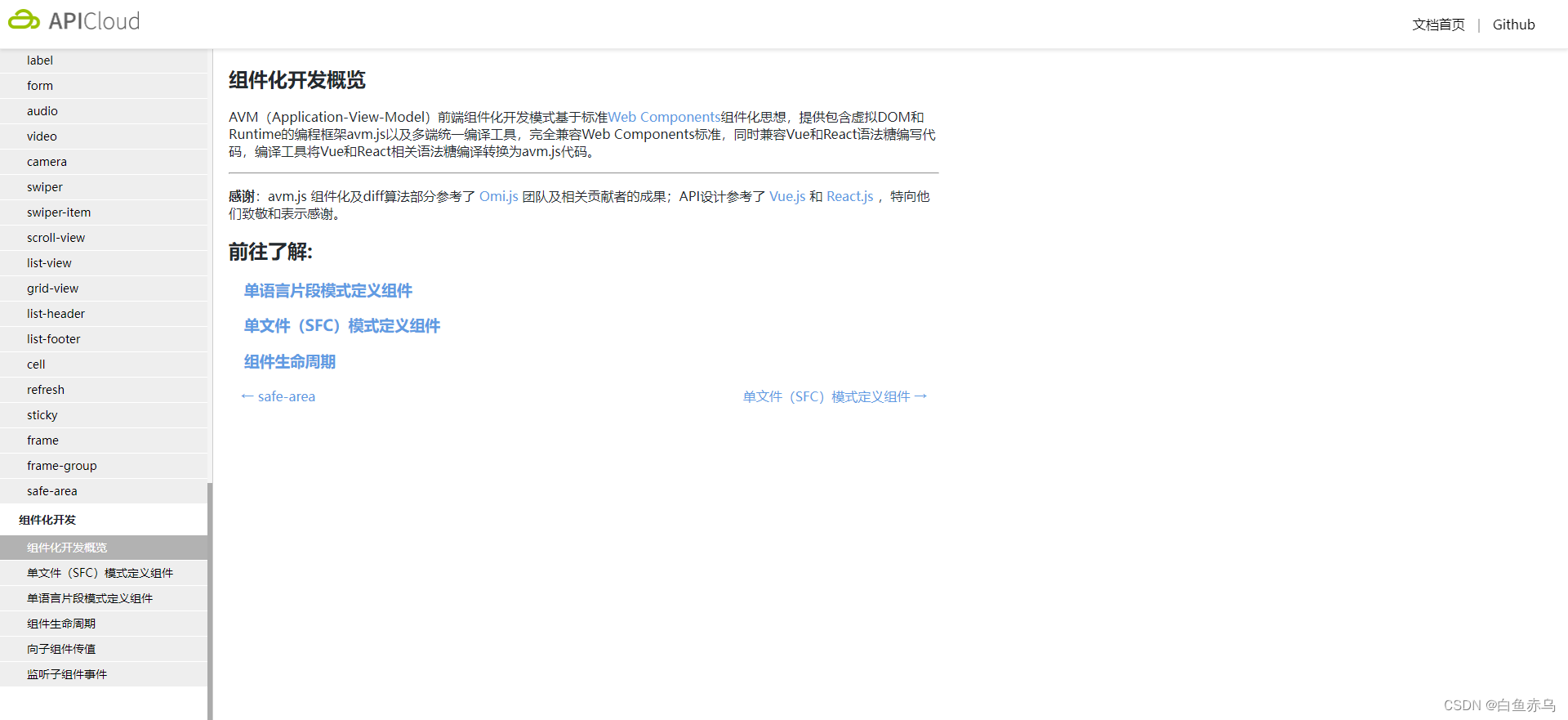
AVM(Application-View-Model)前端组件化开发模式基于标准Web Components组件化思想,提供包含虚拟DOM和Runtime的编程框架avm.js以及多端统一编译工具,完全兼容Web Components标准,同时兼容Vue和React语法糖编写代码,编译工具将Vue和React相关语法糖编译转换为avm.js代码。
基于标准 Web Components 组件化思想,兼容 Vue / React 语法特性,通过一次编码,分别编译为 App、小程序代码,实现多端开发。
组件功能介绍
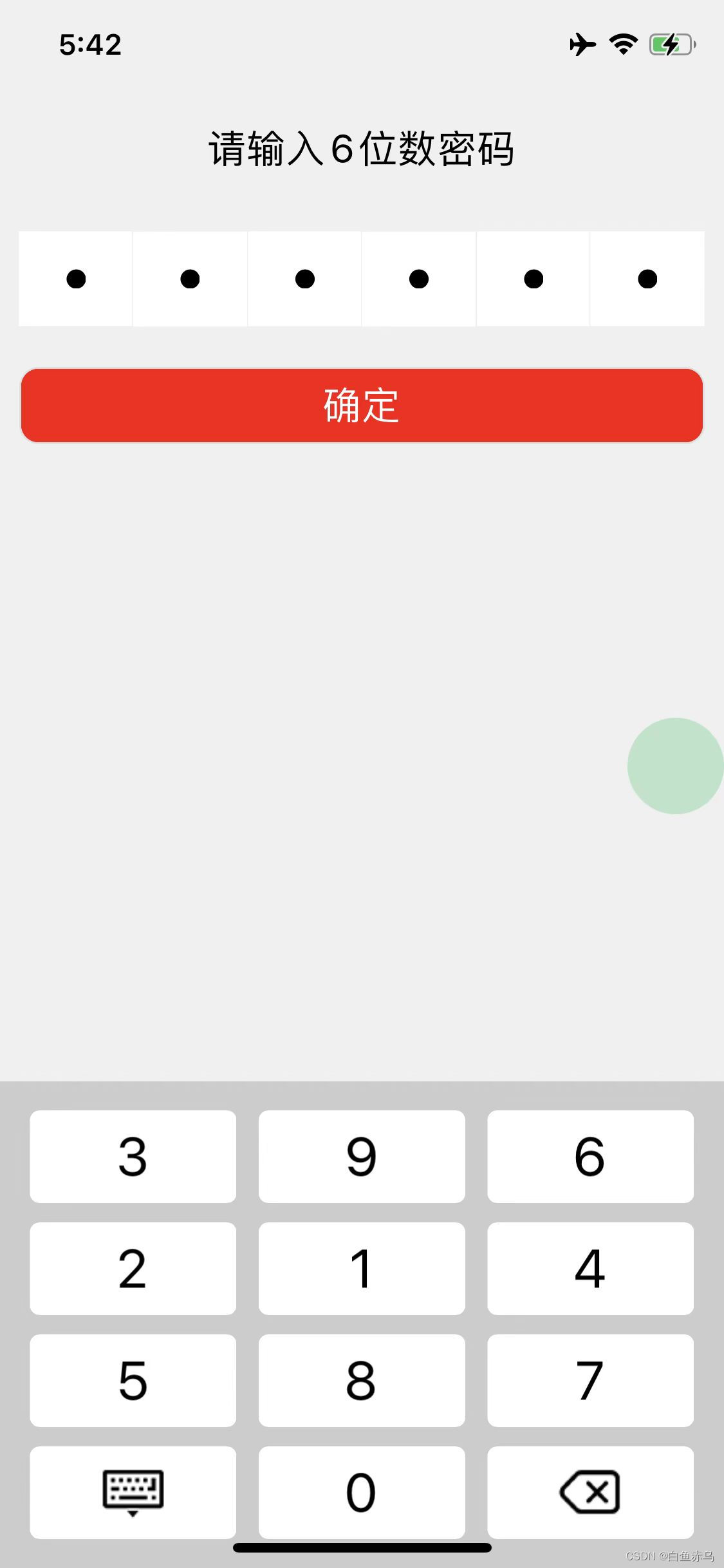
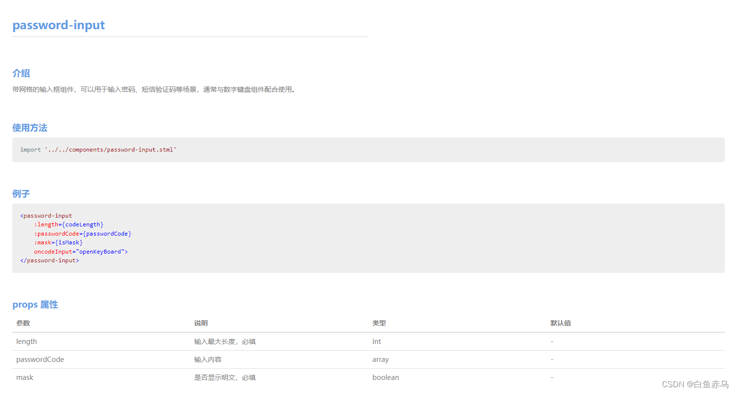
带网格的输入框组件,可以用于输入密码、短信验证码等场景,通常与数字键盘组件配合使用。
支持自定义密码长度,支持加密和明文显示。
支持自定义密码长度,支持加密和明文显示。
组件示例

组件开发
组件文件
password-input.stml
<template>
<view class="password-input_container">
<view class="password-input_security">
<view class="password-input_item" v-for="(item,index) in codeArr" data-index={index} @click="codeInput">
<text class="password-input_item-word--hidden" v-if="this.props.passwordCode[index] && !this.props.mask"></text>
<text class="password-input_item-word--mask" v-if="this.props.passwordCode[index] && this.props.mask">{this.props.passwordCode[index]}</text>
</view>
</view>
</view>
</template>
<script>
export default {
name: 'password-input',
props:{
length:Number,
passwordCode:Array,
mask:Boolean
},
install(){
for (let index = 0; index < this.props.length; index++) {
this.data.codeArr[index]=null;
}
},
data() {
return{
codeArr:[]
}
},
methods: {
codeInput(e){
this.fire('codeClick','');
}
}
}
</script>
<style>
.password-input_container {
margin: 10px;
}
.password-input_security{
flex-flow: row nowrap;
height: 50px;
}
.password-input_item{
display: flex;
align-items: center;
flex: 1;
background-color: #fff;
height: 100%;
border: 0.5px solid #eee;
margin: -0.5px;
justify-content: center;
}
.password-input_item-word--hidden{
width: 10px;
height: 10px;
background-color: #000;
border-radius: 100%;
}
.password-input_item-word--mask{
font-size: 30px;
text-align: center;
}
</style>
组件使用说明
本组件是基于AVM.js开发的多端组件,通常同时适配Android、iOS、小程序、H5 , 具体支持情况还要看每个组件的说明文档。
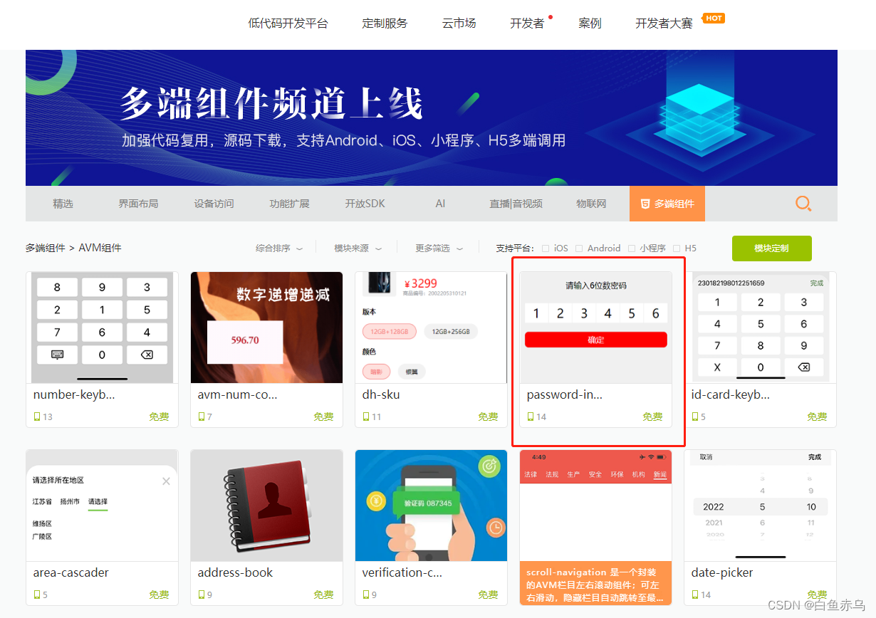
首先需要登录开发平台。 通过控制平台右上方的模块Store进入,然后选择AVM组件。
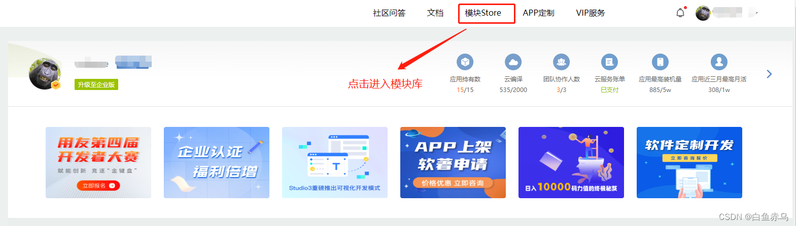
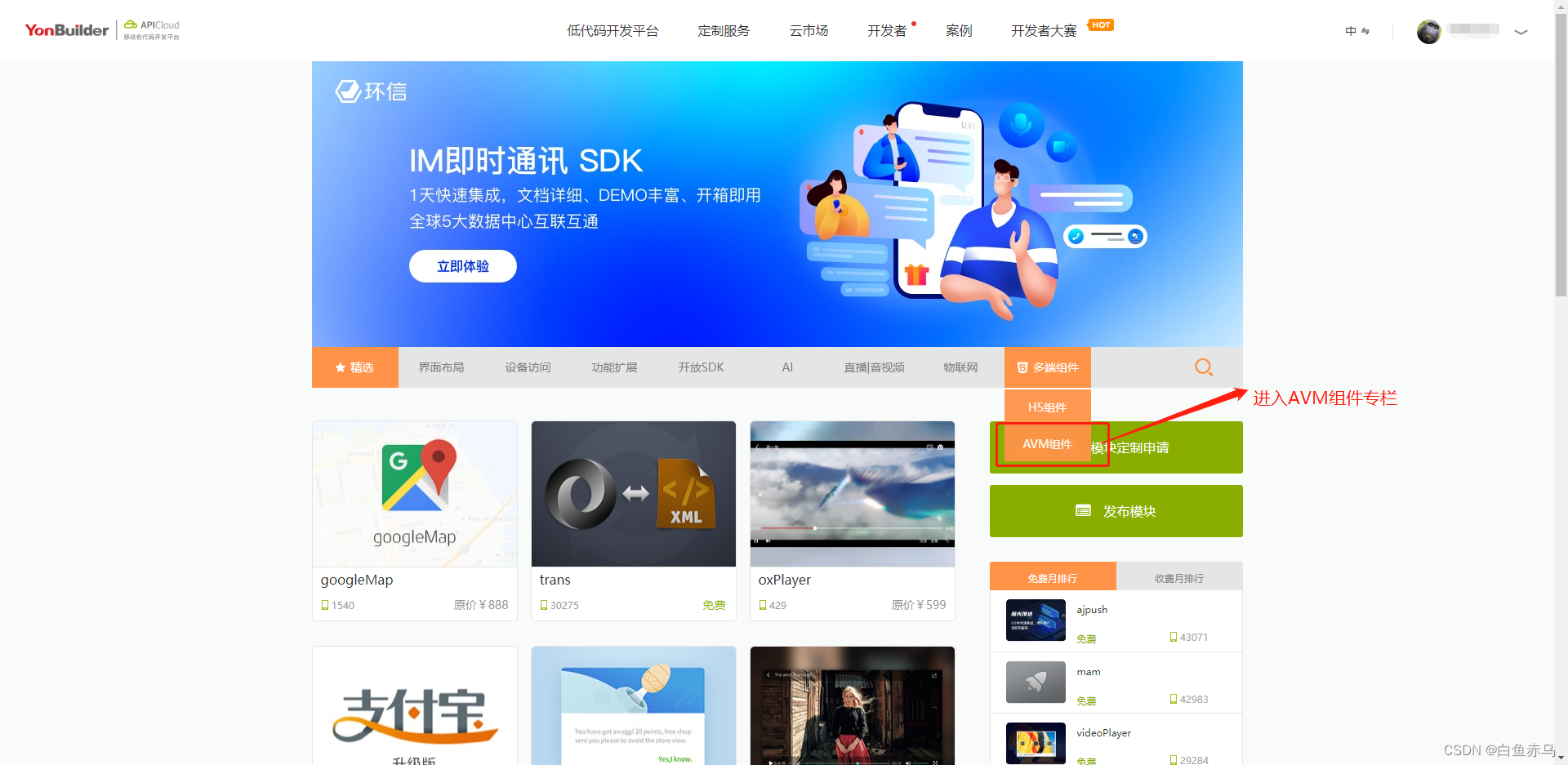
找到对应模块点击进入。
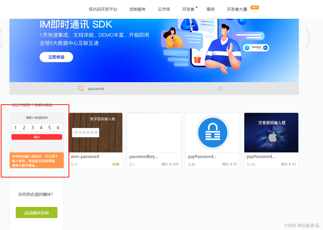
也可通过搜索栏,通过组件名称关键字进行检索。
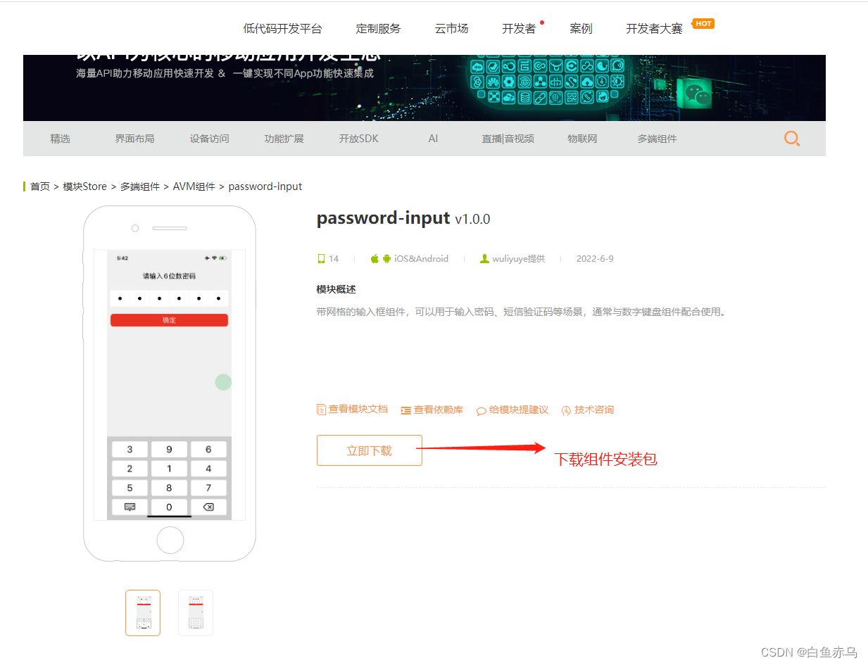
进入模块详情,点击立即下载下载完整的组件安装包。
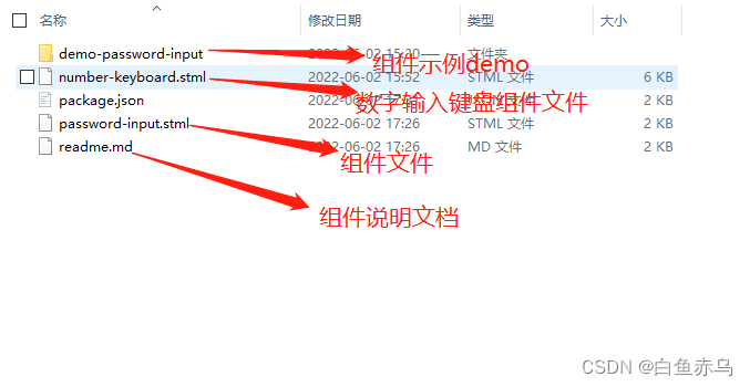
组件压缩包的文件目录如下
也可通过查看模块文档 来了解模块的具体参数,引用的原生模块,注意事项等。
具体在项目中的使用步骤是,第一步将压缩文件中的easy-password-input.stml和easy-number-keyboard.stml(需要数字键盘配合使用)文件拷贝到项目的components目录,通过阅读readme.md 文档和查看demo示例文件 demo-easy-password-input.stml在需要开发的stml文件中,引入组件文件,完成页面的开发。
示例文件
demo-password-input.stml
<template>
<view class="page">
<safe-area></safe-area>
<text class="title">请输入6位数密码</text>
<password-input
:length={codeLength}
:passwordCode={passwordCode}
:mask={isMask}
notallow="openKeyBoard">
</password-input>
<button class="btn">确定</button>
<number-keyboard
:limitLengh="codeLength"
:recnetNumber="passwordCode"
:isRandom="isRandom"
:isModel="isModel"
notallow="closeNumberBoard"
notallow="getNumber"
notallow="deleteNumber"
v-if="isShowNUmberBoard">
</number-keyboard>
</view>
</template>
<script>
import '../../components/password-input.stml'
import '../../components/number-keyboard.stml'
export default {
name: 'demo-password-input',
apiready(){
},
data() {
return{
codeLength:6,
passwordCode:[],
isRandom:true,
isShowNUmberBoard:false,
isModel:true,
isMask:false,
passwordCodeStr:'',
}
},
methods: {
closeNumberBoard(e){
this.data.isShowNUmberBoard = false;
},
getNumber(e){
// console.log(JSON.stringify(e));
this.data.passwordCode = e.detail;
this.data.passwordCodeStr = this.data.passwordCode.join('');
if(this.data.passwordCode.length==this.data.codeLength){
this.data.isShowNUmberBoard = false;
}
},
deleteNumber(e){
this.data.passwordCode = e.detail;
this.data.passwordCodeStr = this.data.passwordCode.join('');
},
openKeyBoard(e){
this.data.isShowNUmberBoard = true;
}
}
}
</script>
<style>
.page {
height: 100%;
background-color: #f0f0f0;
}
.title{
text-align: center;
font-size: 20px;
padding: 20px 0;
}
.btn{
margin: 10px;
background-color: #ff0000;
color: #ffffff;
border-radius: 10px;
font-size: 20px;
}
</style>
如果在AVM组件库中,没有找到实际项目中需要的组件,可以自己尝试封装组件。
这是组件化开发的在线文档地址