优美的小程序启动页(附源码)
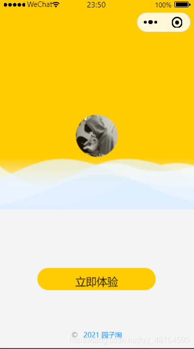
1. 看效果
2.注意点
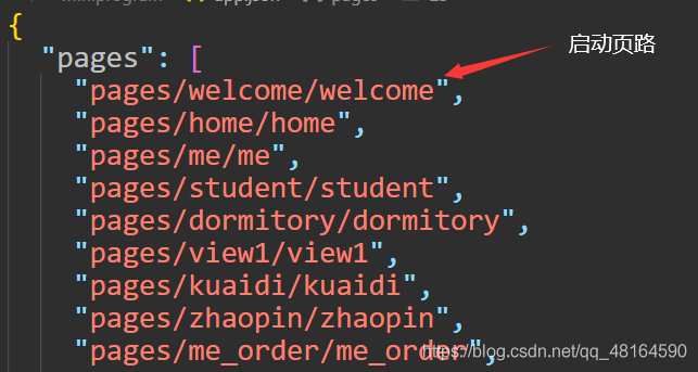
实现这一效果其实是很简单的,首先我们要把自己设置的启动页的路径写在app.jon中,注意小程序默认第一个路径是小程序加载的开始页。
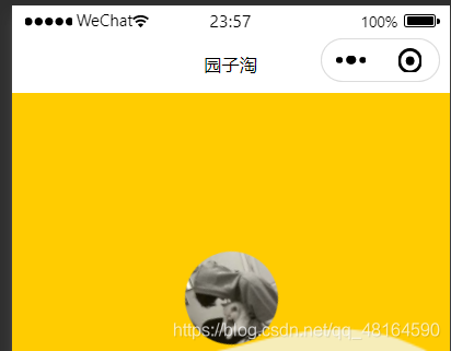
其次我们的页面有时会出现这种情况,这是应为在x.json文件中未设置其头部导航栏的颜色。程序默认是白色。我们只需要在x.json中加navigationBarBackgroundColor": “你想要的颜色”。
3.实现
3.1:wxml
<!--start.wxml-->
<view class="container">
 <view class="remind-box" wx:if="{{remind}}">
 </view>
 <block wx:else>
  <view class="content">
   <view class="hd" style="transform:rotateZ({{angle}}deg);">
    <open-data class="logo" type="userAvatarUrl"></open-data>
    <image class="wave" src="/image/bo.png" mode="aspectFill"></image>
    <image class="wave wave-bg" src="/image/bo.png" mode="aspectFill"></image>
   </view>
   <view class="bd">
    <view class="confirm-btn">
     <button open-type="getUserInfo" lang="zh_CN" bindtap="goLogin">立即体验</button>
    </view>
    <view class="copyright">© {{year}} <text bindtap='goTeam'>2021 园子淘</text> </view>
   </view>
  </view>
 </block>
</view>2.3:wcss
/**start.wxss**/
.container {
background: #ffcc01;
align-items: stretch;
padding: 0;
height: 100vh;
overflow: hidden;
}
.content {
flex: 1;
display: flex;
position: relative;
z-index: 10;
flex-direction: column;
align-items: stretch;
justify-content: center;
width: 100%;
height: 100%;
padding-bottom: 450rpx;
background: -webkit-gradient(linear, left top, left bottom, from(rgba(244, 244, 244, 0)), color-stop(0.1, #f4f4f4), to(#f4f4f4));
opacity: 0;
transform: translate3d(0, 100%, 0);
animation: rise 3s cubic-bezier(0.19, 1, 0.22, 1) .25s forwards;
}
rise {
0% {
opacity: 0;
transform: translate3d(0, 100%, 0);
}
50% {
opacity: 1;
}
100% {
opacity: 1;
transform: translate3d(0, 450rpx, 0);
}
}
.title {
position: absolute;
top: 30rpx;
left: 50%;
width: 600rpx;
height: 200rpx;
margin-left: -300rpx;
opacity: 0;
animation: show 2.5s cubic-bezier(0.19, 1, 0.22, 1) .5s forwards;
}
.smalltitle {
position: absolute;
top: 50rpx;
left: 50%;
width: 600rpx;
height: 200rpx;
margin-left: -300rpx;
opacity: 0;
animation: show 2.5s cubic-bezier(0.19, 1, 0.22, 1) .5s forwards;
}
show {
0% {
opacity: 0;
}
100% {
opacity: .95;
}
}
.hd {
position: absolute;
top: 0;
left: 50%;
width: 1000rpx;
margin-left: -500rpx;
height: 200rpx;
transition: all .35s ease;
}
.logo {
position: absolute;
z-index: 2;
left: 50%;
bottom: 200rpx;
width: 160rpx;
height: 160rpx;
margin-left: -80rpx;
animation: sway 10s ease-in-out infinite;
opacity: .95;
overflow: hidden;
border-radius: 80rpx;
}
sway {
0% {
transform: translate3d(0, 20rpx, 0) rotate(-15deg);
}
17% {
transform: translate3d(0, 0rpx, 0) rotate(25deg);
}
34% {
transform: translate3d(0, -20rpx, 0) rotate(-20deg);
}
50% {
transform: translate3d(0, -10rpx, 0) rotate(15deg);
}
67% {
transform: translate3d(0, 10rpx, 0) rotate(-25deg);
}
84% {
transform: translate3d(0, 15rpx, 0) rotate(15deg);
}
100% {
transform: translate3d(0, 20rpx, 0) rotate(-15deg);
}
}
.wave {
position: absolute;
z-index: 3;
right: 0;
bottom: 0;
opacity: 0.725;
height: 260rpx;
width: 2250rpx;
animation: wave 10s linear infinite;
}
.wave-bg {
z-index: 1;
animation: wave-bg 10.25s linear infinite;
}
wave {
from {
transform: translate3d(125rpx, 0, 0);
}
to {
transform: translate3d(1125rpx, 0, 0);
}
}
wave-bg {
from {
transform: translate3d(375rpx, 0, 0);
}
to {
transform: translate3d(1375rpx, 0, 0);
}
}
.bd {
position: relative;
flex: 1;
display: flex;
flex-direction: column;
align-items: stretch;
animation: bd-rise 2s cubic-bezier(0.23, 1, 0.32, 1) .75s forwards;
opacity: 0;
margin-top: 6%;
}
bd-rise {
from {
opacity: 0;
transform: translate3d(0, 60rpx, 0);
}
to {
opacity: 1;
transform: translate3d(0, 0, 0);
}
}
form {
flex: 1;
display: flex;
flex-direction: column;
align-items: stretch;
justify-content: center;
}
.input-group {
display: flex;
align-items: center;
padding: 25rpx 10rpx;
margin: 40rpx 3%;
background: #fff;
border-radius: 5px;
border: 2px solid #f4f4f4;
transition: all .25s ease-in-out;
}
.input-group.active {
border: 2px solid #7acfa6;
}
.input-label {
color: #888;
font-size: 13pt;
height: 25rpx;
line-height: 25rpx;
padding: 0 25rpx;
border-right: 1px solid #d8d8d8;
}
.input-group input,
.input-group picker {
flex: 1;
font-size: 13pt;
min-height: 52rpx;
height: 52rpx;
line-height: 52rpx;
padding: 0 25rpx;
}
.input-placeholder,
.input-group picker.placeholder {
color: #ccc;
}
.login-help {
display: flex;
align-items: center;
justify-content: flex-end;
padding: 0 30rpx;
font-size: 10pt;
color: #bbb;
}
.login-help-img {
width: 11pt;
height: 11pt;
margin: 0 5rpx;
}
.confirm-logo {
font-size: 13pt;
line-height: 200px;
height: 85rpx;
text-align: center;
}
.confirm-btn button {
font-size: 13pt;
height: 85rpx;
background: #ffcc01;
color: black;
text-align: center;
border-radius: 50px;
margin: 50% 20% 30% 20%;
}
.help {
position: absolute;
z-index: 100;
top: 0;
left: 0;
width: 100%;
height: 100%;
display: flex;
align-items: center;
justify-content: center;
}
.box {
position: relative;
display: flex;
flex-direction: column;
align-items: stretch;
width: 80%;
background: #fff;
border-radius: 10px;
box-shadow: 0 0 50px rgba(22, 22, 22, .35);
transform: translate3d(0, -400rpx, 0);
}
.box-hd {
display: flex;
align-items: center;
justify-content: center;
height: 100rpx;
border-bottom: 1px solid #eee;
}
.box-title {
font-size: 13pt;
}
.box-close {
position: absolute;
right: 20rpx;
width: 35rpx;
height: 35rpx;
padding: 15rpx;
}
.box-bd {
flex: 1;
display: flex;
flex-direction: column;
padding: 15rpx 40rpx 30rpx;
}
.help-q {
color: #999;
font-size: 11pt;
line-height: 200%;
margin-top: 5rpx;
}
.help-a {
text-indent: 1em;
line-height: 160%;
display: flex;
flex-direction: column;
}
.help-a text {
word-break: break-all;
}
/**登录动画**/
.login_video {
position: absolute;
z-index: 1;
top: 50%;
left: 50%;
width: 750rpx;
margin-left: -375rpx;
height: 1334rpx;
margin-top: -667rpx;
}
.video_hidden {
visibility: hidden;
}
page .wx-video-bar {
display: none;
}
.copyright {
font-size: 28rpx;
color: #999;
position: fixed;
top: 85%;
left: 0;
right: 0;
padding: 30rpx;
text-align: center;
}
.copyright text {
font-size: 28rpx;
color: #118fff;
margin-left: 15rpx;
}3.3:js
//login.js
//获取应用实例
var app = getApp();
Page({
  data: {
    remind: '加载中',
    angle: 0,
    user: {}
  },
  onLoad: function() {
    var that = this
  },
  goLogin: function() {
    let that = this
    let user = wx.getStorageSync('user')
    if (!user) {
      wx.switchTab({
        url: '/pages/me/me',
      })
    } else {
      that.setData({
        user: user
      })
      wx.switchTab({
        url: '/pages/home/home',
      })
    }
  },
  onReady: function() {
    var that = this;
    setTimeout(function() {
      that.setData({
        remind: ''
      });
    }, 1000);
    wx.onAccelerometerChange(function(res) {
      var angle = -(res.x * 30).toFixed(1);
      if (angle > 14) {
        angle = 14;
      } else if (angle < -14) {
        angle = -14;
      }
      if (that.data.angle !== angle) {
        that.setData({
          angle: angle
        });
      }
    });
  }
});


