1.flex布局及其他基本概念
1.1 什么是flex布局
- Flexible Box缩写为“flex”,意为弹性布局
- 任何一个布局都可以指定为flex布局
- 行内元素也可以指定为flex布局
- 指定flex布局以后,子元素的float、clear和vertical-align属性都会失效
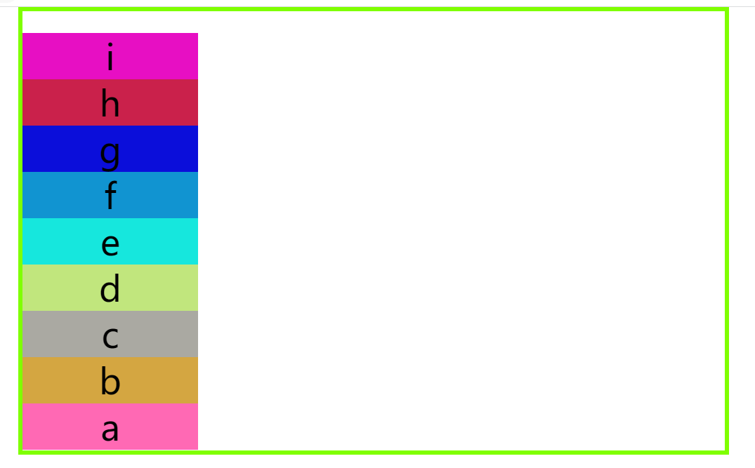
1.2 容器、项目、主轴、交叉轴
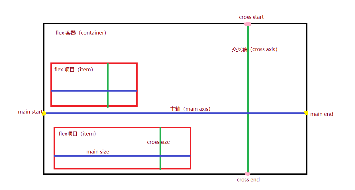
- flex 容器:采用flex布局的元素叫做flex容器
- flex 项目:flex的所有子元素称为flex项目
- 主轴(main axis):flex容器默认存在两根轴,水平的为主轴,主轴与容器左边框的脚垫叫做“main start”,右边框的交点叫做“main end”
- 交叉轴(cross axis):垂直方向的为交叉轴,交叉轴与容器上边框的交点叫做“cross start”,下边框的交点叫做“cross end”
2.容器属性
2.1 flex-direction属性
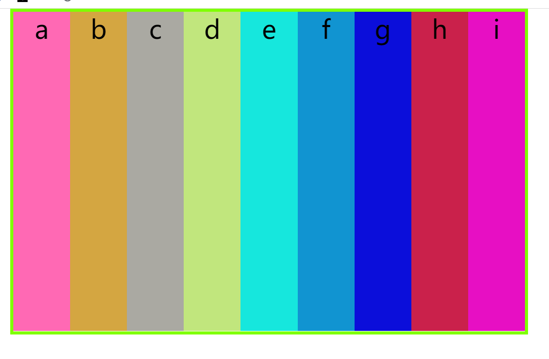
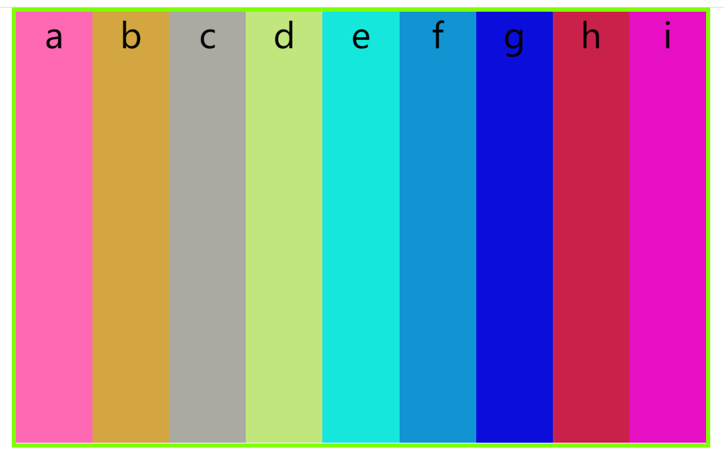
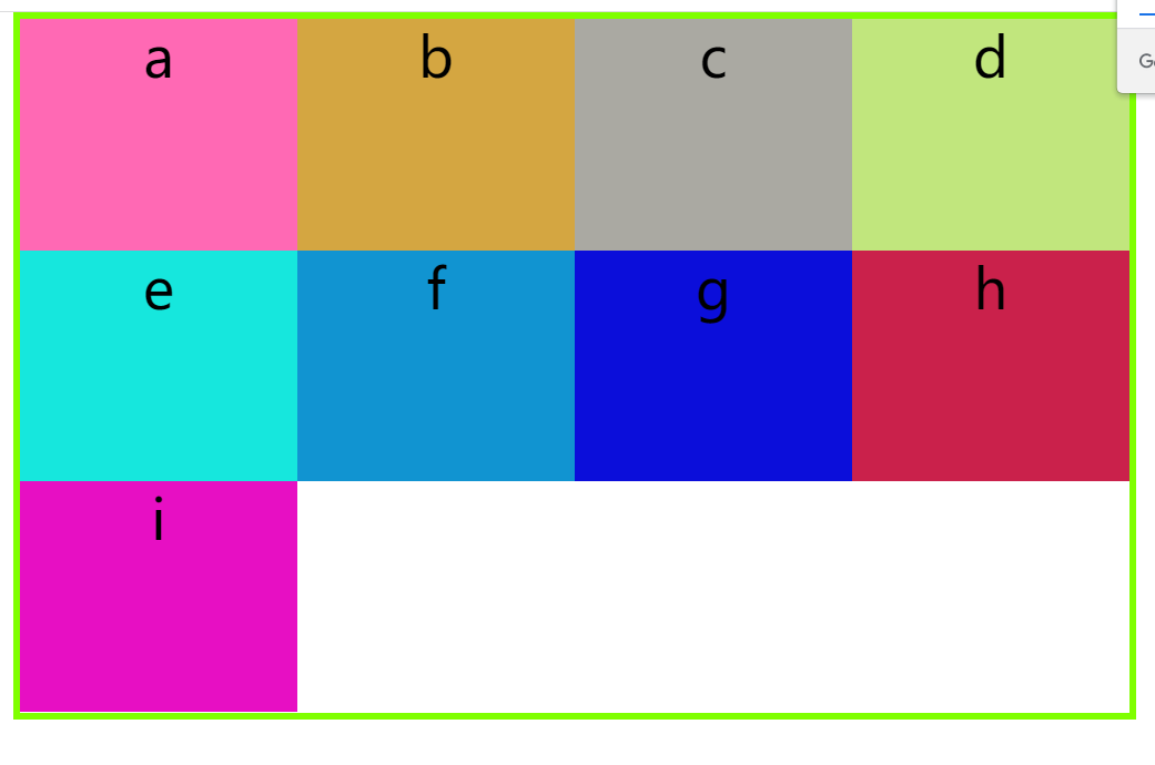
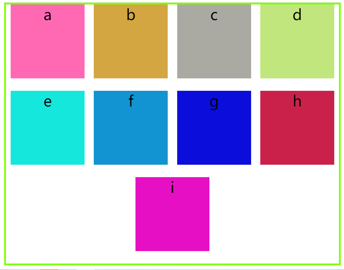
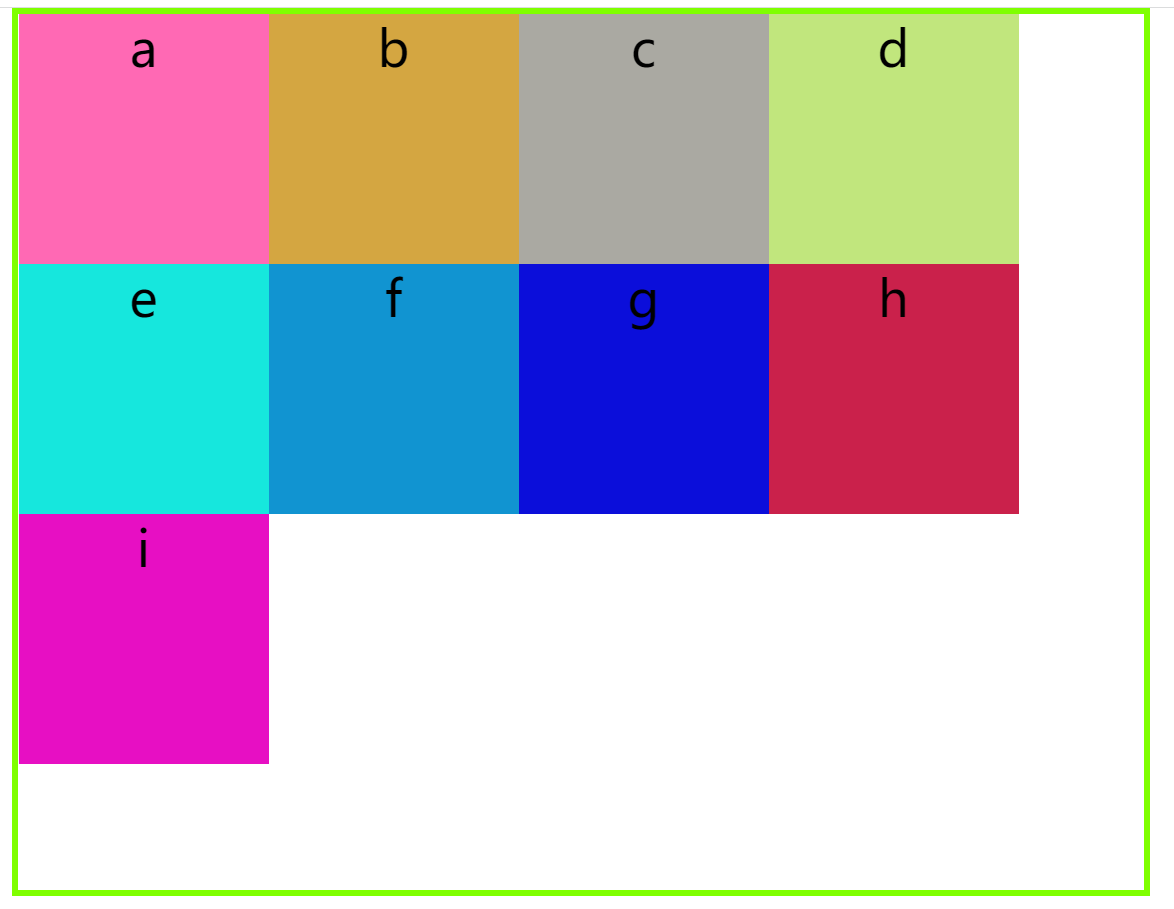
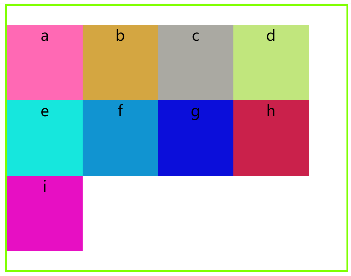
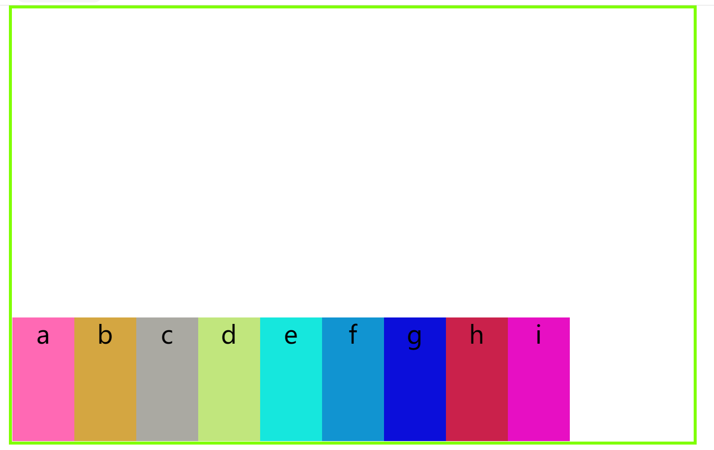
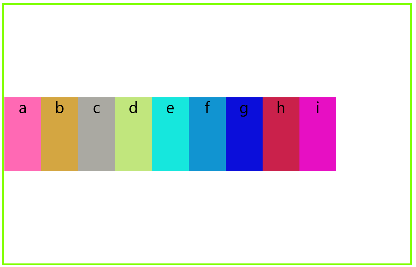
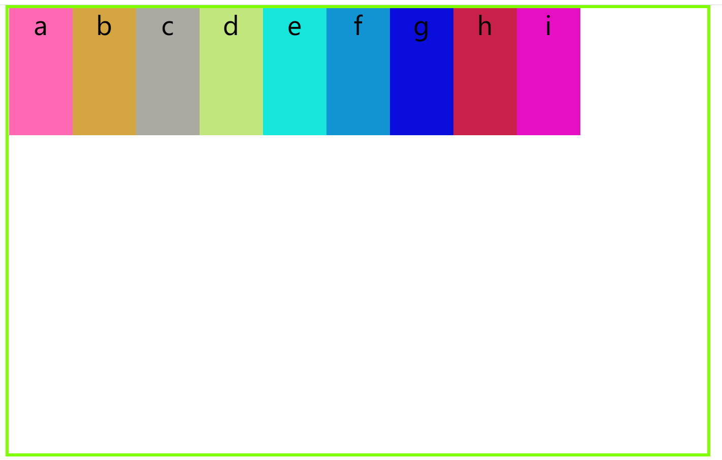
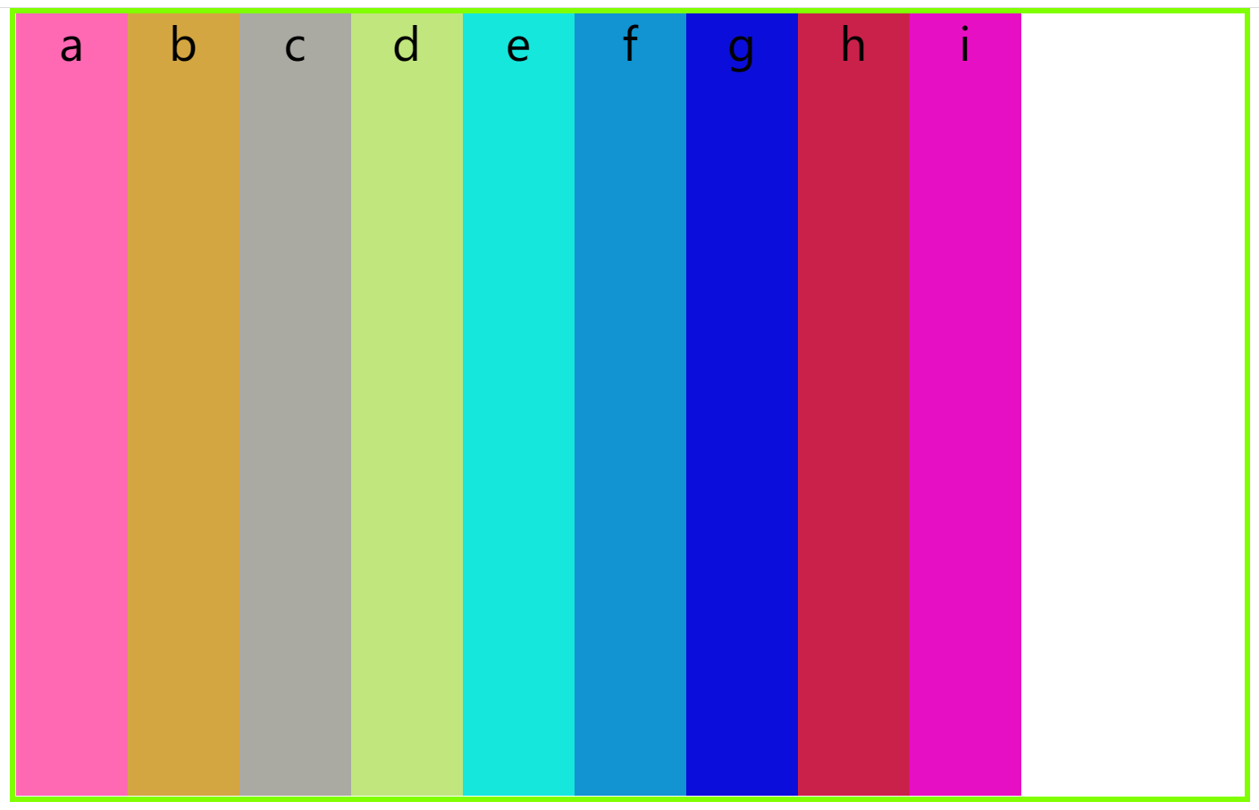
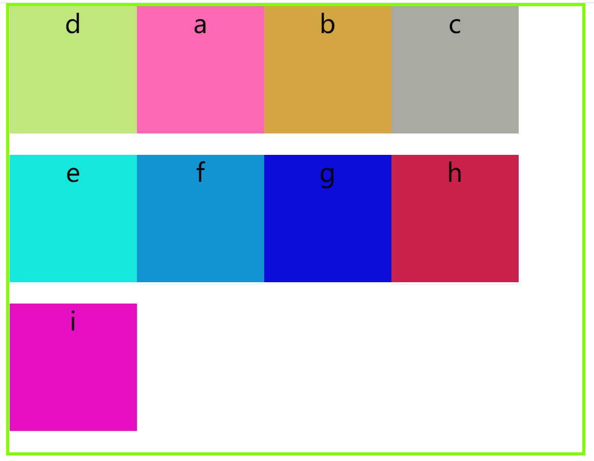
flex-direction属性:决定主轴的方向,即项目排列的方向,它有4个取值:row(默认值);row-reverse;column;column-reverse
(1)row:主轴为水平方向且主轴起点位置在左边
 .box{
        border: chartreuse 5px solid;
        width: 800px;
        height: 500px;
        display: flex;
        margin: auto;
        flex-direction: row;
    }
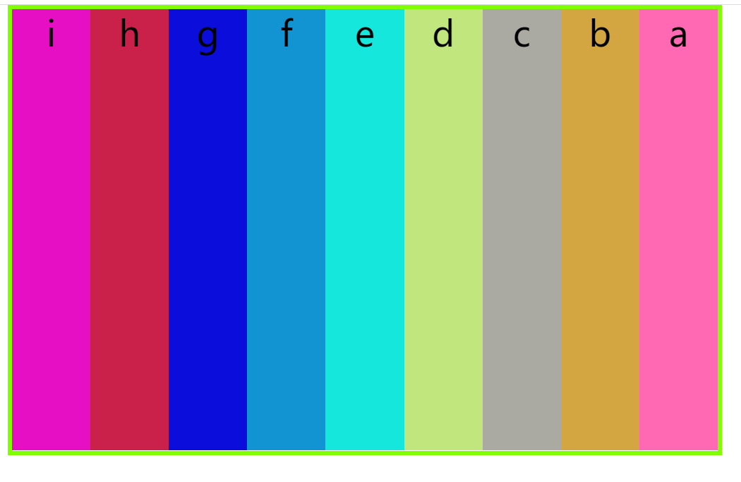
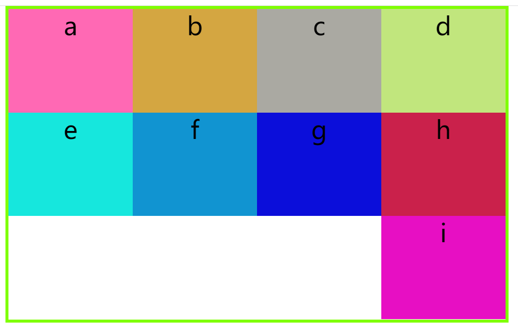
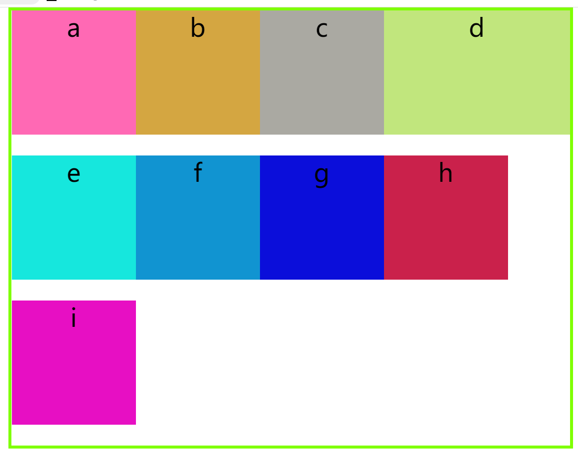
(2)row-reverse:主轴为水平方向,但是主轴的起点位置在右边
 .box{
        border: chartreuse 5px solid;
        width: 800px;
        height: 500px;
        display: flex;
        margin: auto;
        /* 设置主轴方向 */
        flex-direction: row-reverse;
    }
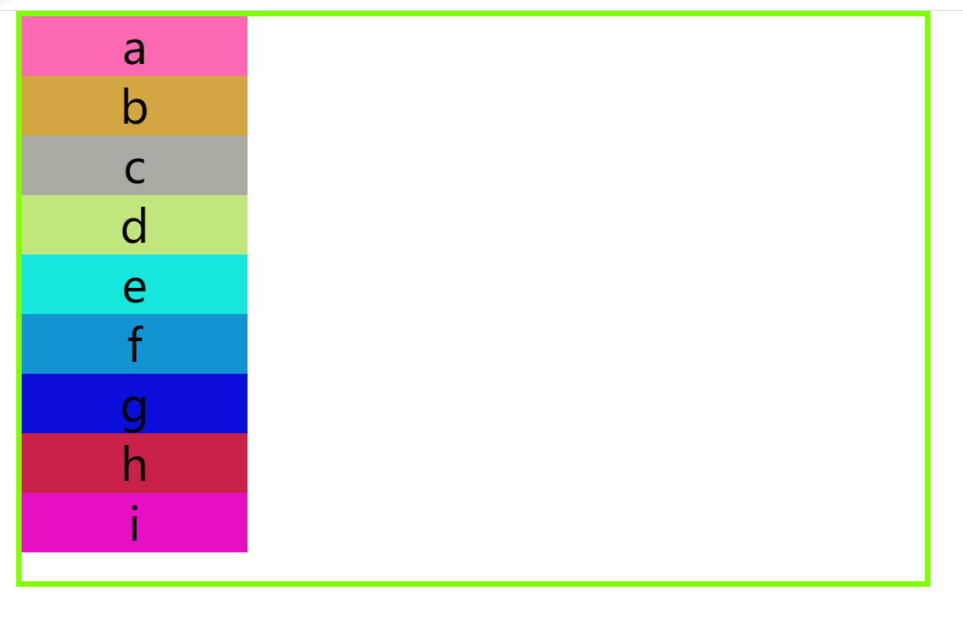
(3)column:主轴为垂直方向且起点位置在上边框的交点
.box{
        border: chartreuse 5px solid;
        width: 800px;
        height: 500px;
        display: flex;
        margin: auto;
        /* 设置主轴方向 */
        flex-direction:column;
    }
(4)column-reverse:主轴在垂直方向但是主轴起点在与下边框的交点位置
  .box{
        border: chartreuse 5px solid;
        width: 800px;
        height: 500px;
        display: flex;
        margin: auto;
        /* 设置主轴方向 */
        flex-direction:column-reverse;
    }
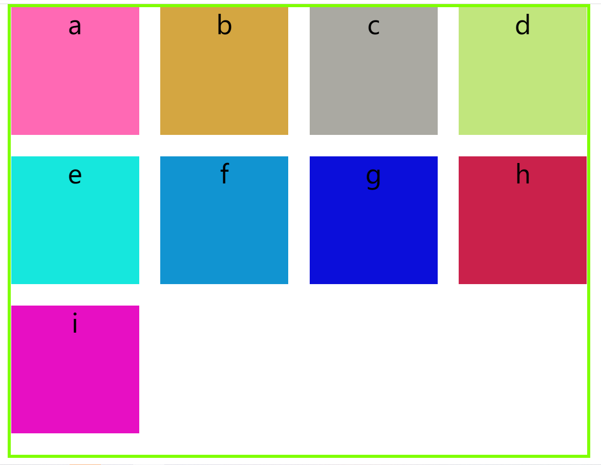
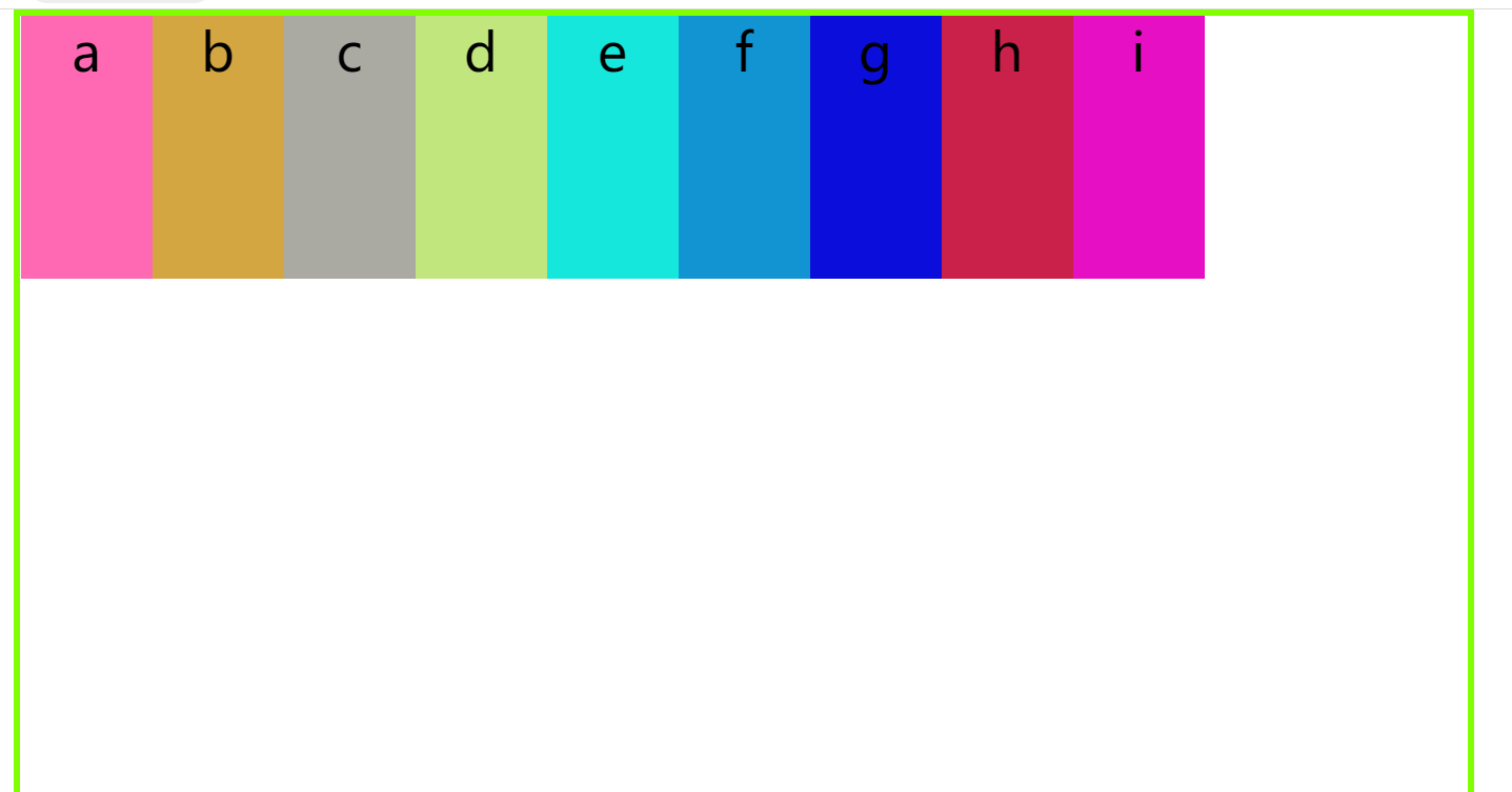
2.2 flex-wrap属性
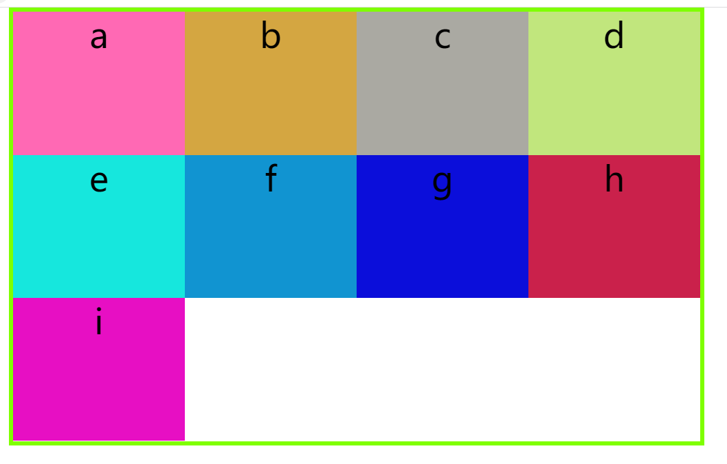
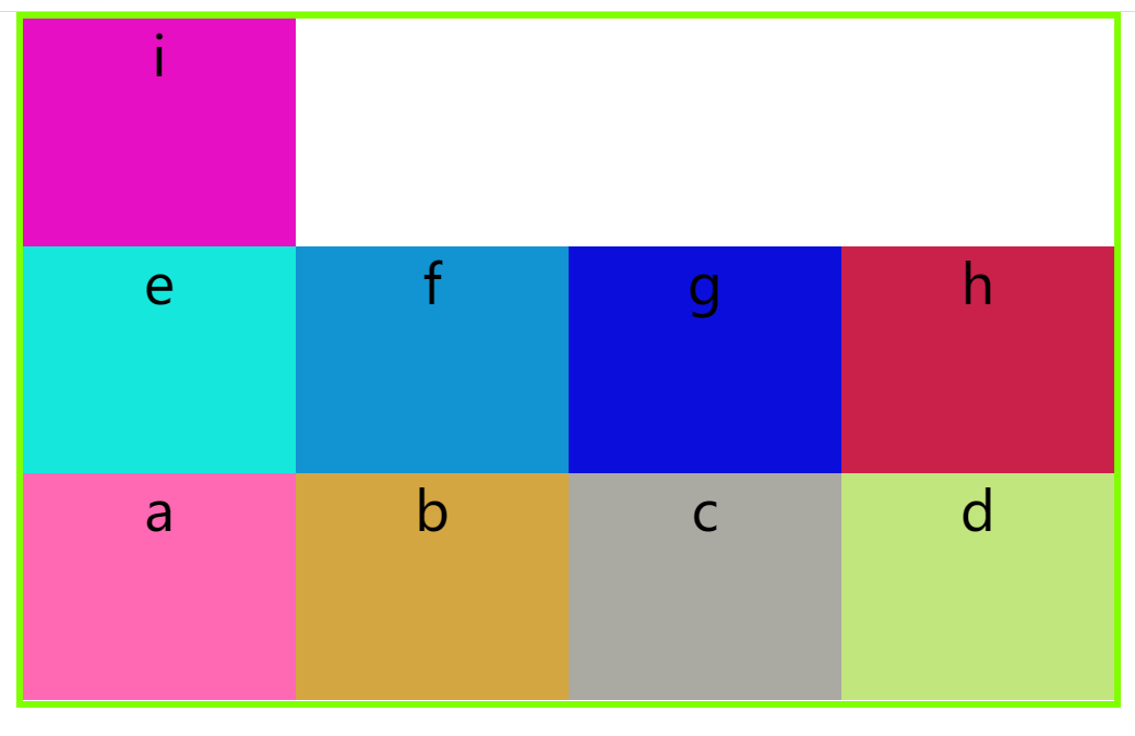
flex-wrap:一般来说,项目都会排列在一行,flex-wrap可以定义如何换行,它常用的有3个取值:nowrap;wrap;wrap-reverse
(1)nowrap(默认值):不换行
 .box{
        border: chartreuse 5px solid;
        width: 800px;
        height: 500px;
        display: flex;
        margin: auto;
        /* 设置主轴方向 */
        flex-direction:row;
        /* 设置项目在容器中如果一行展示不完 是否要换行 */
        flex-wrap:nowrap ;
    }
(2)wrap:换行,第一行在上面
.box{
        border: chartreuse 5px solid;
        width: 800px;
        height: 500px;
        display: flex;
        margin: auto;
        /* 设置主轴方向 */
        flex-direction:row;
        /* 设置项目在容器中如果一行展示不完 是否要换行 */
        flex-wrap:wrap ;
    }
(3) wrap-reverse:换行,第一行在下面
.box{
        border: chartreuse 5px solid;
        width: 800px;
        height: 500px;
        display: flex;
        margin: auto;
        /* 设置主轴方向 */
        flex-direction:row;
        /* 设置项目在容器中如果一行展示不完 是否要换行 */
        flex-wrap:wrap-reverse ;
    }
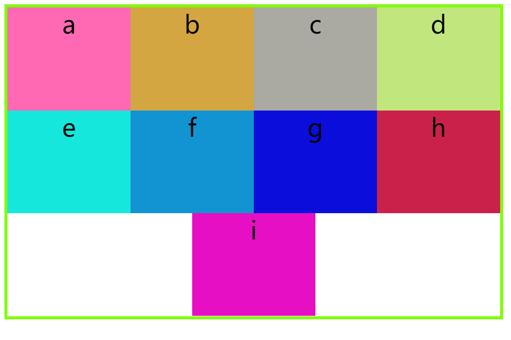
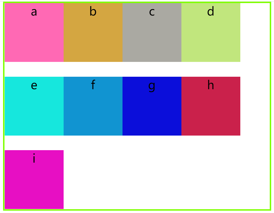
2.3 justify-content属性
justify-content:设置了项目在主轴上的对齐方式,它的常用取值有:
flex-start,flex-end,center,space-between,space-around,space-evenly
(1)flex-start(默认值):左对齐
.box{
        border: chartreuse 5px solid;
        width: 800px;
        height: 500px;
        display: flex;
        margin: auto;
        /* 设置主轴方向 */
        flex-direction:row;
        /* 设置项目在容器中如果一行展示不完 是否要换行 */
        flex-wrap:wrap ;
        /* 设置项目对齐方式 */
        justify-content: flex-start;
    }
(2)flex-end:右对齐
  .box{
        border: chartreuse 5px solid;
        width: 800px;
        height: 500px;
        display: flex;
        margin: auto;
        /* 设置主轴方向 */
        flex-direction:row;
        /* 设置项目在容器中如果一行展示不完 是否要换行 */
        flex-wrap:wrap ;
        /* 设置项目对齐方式 */
        justify-content: flex-end;
    }
(3)center:居中
 .box{
        border: chartreuse 5px solid;
        width: 800px;
        height: 500px;
        display: flex;
        margin: auto;
        /* 设置主轴方向 */
        flex-direction:row;
        /* 设置项目在容器中如果一行展示不完 是否要换行 */
        flex-wrap:wrap ;
        /* 设置项目对齐方式 */
        justify-content: center;
    }
(4)space-between:两端对齐,项目之间的间隔都相等
 .box{
        border: chartreuse 5px solid;
        width: 900px;
        height: 700px;
        display: flex;
        margin: auto;
        /* 设置主轴方向 */
        flex-direction:row;
        /* 设置项目在容器中如果一行展示不完 是否要换行 */
        flex-wrap:wrap ;
        /* 设置项目对齐方式 */
        justify-content:space-between;
    }
(5)space-around:每个项目两侧的间隔相等,项目之间的间隔比项目与容器边框的间隔大一倍
 .box{
        border: chartreuse 5px solid;
        width: 900px;
        height: 700px;
        display: flex;
        margin: auto;
        /* 设置主轴方向 */
        flex-direction:row;
        /* 设置项目在容器中如果一行展示不完 是否要换行 */
        flex-wrap:wrap ;
        /* 设置项目对齐方式 */
        justify-content:space-around;
    }
(6)space-evenly - 项目与项目的间隔相等,项目与容器边框之间也是同样长度的间隔
.box{
        border: chartreuse 5px solid;
        width: 900px;
        height: 700px;
        display: flex;
        margin: auto;
        /* 设置主轴方向 */
        flex-direction:row;
        /* 设置项目在容器中如果一行展示不完 是否要换行 */
        flex-wrap:wrap ;
        /* 设置项目对齐方式 */
        justify-content:space-evenly;
    }
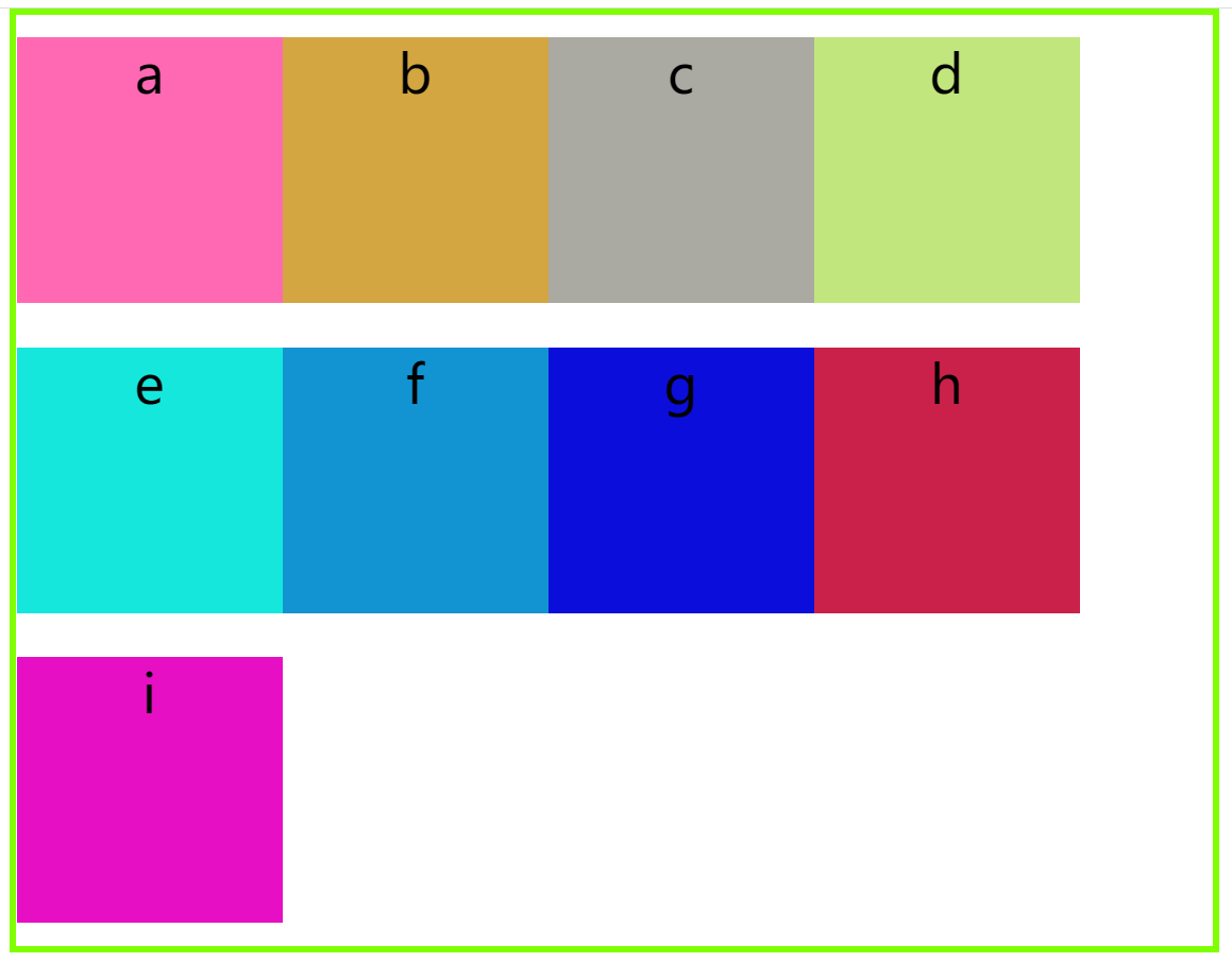
2.4 align-content属性
align-content:定义了项目在容器中的交叉轴对齐方式 ,它常用的取值有:flex-start,flex-end,center,space-between,space-around,space-evenly
(1)flex-start(默认值):与交叉轴的起点对齐
.box{
        border: chartreuse 5px solid;
        width: 900px;
        height: 700px;
        display: flex;
        margin: auto;
        /* 设置主轴方向 */
        flex-direction:row;
        /* 设置项目在容器中如果一行展示不完 是否要换行 */
        flex-wrap:wrap ;
        /* 设置项目对齐方式 */
        justify-content:flex-start;
        /* 设置交叉轴对齐方式 */
        align-content: flex-start;
    }
(2)flex-end:与交叉轴的终点对齐
.box{
        border: chartreuse 5px solid;
        width: 900px;
        height: 700px;
        display: flex;
        margin: auto;
        /* 设置主轴方向 */
        flex-direction:row;
        /* 设置项目在容器中如果一行展示不完 是否要换行 */
        flex-wrap:wrap ;
        /* 设置项目对齐方式 */
        justify-content:flex-start;
        /* 设置交叉轴对齐方式 */
        align-content: flex-end;
    }
(3)center:与交叉轴的中点对齐
.box{
        border: chartreuse 5px solid;
        width: 900px;
        height: 700px;
        display: flex;
        margin: auto;
        /* 设置主轴方向 */
        flex-direction:row;
        /* 设置项目在容器中如果一行展示不完 是否要换行 */
        flex-wrap:wrap ;
        /* 设置项目对齐方式 */
        justify-content:flex-start;
        /* 设置交叉轴对齐方式 */
        align-content: center;
    }
(4)space-between:与交叉轴两端对齐,轴线之间的间隔平均分布
.box{
        border: chartreuse 5px solid;
        width: 900px;
        height: 700px;
        display: flex;
        margin: auto;
        /* 设置主轴方向 */
        flex-direction:row;
        /* 设置项目在容器中如果一行展示不完 是否要换行 */
        flex-wrap:wrap ;
        /* 设置项目对齐方式 */
        justify-content:flex-start;
        /* 设置交叉轴对齐方式 */
        align-content: space-between;
    }
(5)space-around:每根轴线两侧的间隔都相等,轴线之间的间隔比轴线与边框的间隔大一倍
 .box{
        border: chartreuse 5px solid;
        width: 900px;
        height: 700px;
        display: flex;
        margin: auto;
        /* 设置主轴方向 */
        flex-direction:row;
        /* 设置项目在容器中如果一行展示不完 是否要换行 */
        flex-wrap:wrap ;
        /* 设置项目对齐方式 */
        justify-content:flex-start;
        /* 设置交叉轴对齐方式 */
        align-content: space-around;
    }
2.5 align-items属性
align-items :项目在容器中的交叉轴对齐方式 (只适用单行项目) ,它的常用取值有:flex-start 、flex-end、 center、 baseline、 stretch
(1)flex-start:与交叉轴的起点对齐
.box{
        border: chartreuse 5px solid;
        width: 1100px;
        height: 700px;
        display: flex;
        margin: auto;
        /* 设置主轴方向 */
        flex-direction:row;
        align-items: flex-start;
    }
(2)flex-end:与交叉轴的终点对齐
   .box{
        border: chartreuse 5px solid;
        width: 1100px;
        height: 700px;
        display: flex;
        margin: auto;
        /* 设置主轴方向 */
        flex-direction:row;
        align-items: flex-end;
    }
(3)center:交叉轴的中点对齐
.box{
        border: chartreuse 5px solid;
        width: 1100px;
        height: 700px;
        display: flex;
        margin: auto;
        /* 设置主轴方向 */
        flex-direction:row;
        align-items: center;
    }
(4)baseline: 项目的第一行文字的基线对齐
.box{
        border: chartreuse 5px solid;
        width: 1100px;
        height: 700px;
        display: flex;
        margin: auto;
        /* 设置主轴方向 */
        flex-direction:row;
        align-items: baseline;
    }
(5)stretch:如果项目未设置高度或设为auto,将占满整个容器的高度
.box{
        border: chartreuse 5px solid;
        width: 1100px;
        height: 700px;
        display: flex;
        margin: auto;
        /* 设置主轴方向 */
        flex-direction:row;
        align-items: stretch;
    }
    div{
        font-size: 40px;
        font-weight: 400px;
        text-align: center;
        width: 100px;
    }
3.项目属性
3.1 order属性
order:定义项目的排列顺序,数值越小,排列越靠前,默认为0。
.div4{
        background-color: rgb(193, 230, 125);
        order: -1;
    }
我们给div4设置order值为“-1”,其他的div均为默认值,现在div4在最前面
3.2 flex-grow属性
flex-grow:定义项目的放大比例,默认为0,当它为默认值时,即使存在剩余空间,也不放大。
如果在有剩余空间的前提下,所有项目的flex-grow属性都为1,则它们将等分剩余空间。如果有一个项目的flex-grow属性为2,其他项目都为1,则前者占据的剩余空间将比其他项多一倍。
.div4{
        background-color: rgb(193, 230, 125);
        flex-grow: 1;
    }
3.3 flex-shrink属性
flex-shrink:定义了项目的缩小比例,默认为1,即如果空间不足,该项目将缩小。
如果所有项目的flex-shrink属性都为1,当空间不足时,都将等比例缩小。
如果一个项目的flex-shrink属性为0,其他项目都为1,则空间不足时,前者不缩小。
3.4 align-self属性
align-self:允许单个项目有与其他项目不一样的对齐方式,可覆盖align-items属性。默认值为auto,表示继承父元素的align-items属性,如果没有父元素,则等同于stretch。它的常用取值有 auto 、 flex-start、 flex-end、center、baseline 、 stretch,与align-items属性一致。


