目录
很多时候我们用到三角形这个效果,虽然用图片和其他方法也可以实现,但是修改起来不方便,所以一般使用纯 CSS 的方法来实现。
1、原理
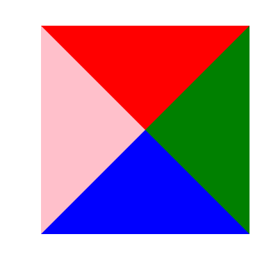
这个原理很简单,我们先看下面的图,这是一个边框为 100px 的 div,看他的边框,是个梯形,变化会从这里开始。

    div {
      height: 50px;
      width: 50px;
      border-width: 100px;
      border-style: solid;
      border-color: red green blue pink;
      margin: 100px auto;
    }
把它的宽和高都设为 0,效果如下图:
四个边框都变成三角形了,现在我再把它的左右和下边框的颜色都设成透明或和背景颜色相同的颜色,就出来我们想要的三角形了。
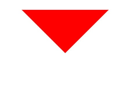
这样,一个三角形就出来了!
2、实现
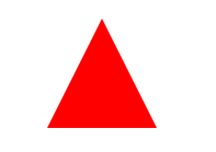
2.1、Triangle Up
    div {
      height: 0;
      width: 0;
      border-bottom: 100px solid red;
      border-right: 50px solid transparent;
      border-left: 50px solid transparent;
      margin: 100px auto;
    }
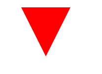
2.2、Triangle Down
    div {
      height: 0;
      width: 0;
      border-top: 100px solid red;
      border-right: 50px solid transparent;
      border-left: 50px solid transparent;
      margin: 100px auto;
    }
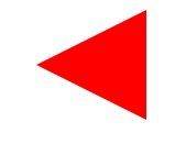
2.3、Triangle Left
    div {
      height: 0;
      width: 0;
      border-right: 100px solid red;
      border-top: 50px solid transparent;
      border-bottom: 50px solid transparent;
      margin: 100px auto;
    }
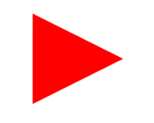
2.4、Triangle Right
    div {
      height: 0;
      width: 0;
      border-left: 100px solid red;
      border-top: 50px solid transparent;
      border-bottom: 50px solid transparent;
      margin: 100px auto;
    }
2.5、Triangle Top Left
    div {
      height: 0;
      width: 0;
      border-top: 100px solid red;
      border-right: 100px solid transparent;
      margin: 100px auto;
    }
2.6、Triangle Top Right
    div {
      height: 0;
      width: 0;
      border-top: 100px solid red;
      border-left: 100px solid transparent;
      margin: 100px auto;
    }
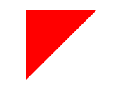
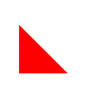
2.7、Triangle Bottom Left
    div {
      height: 0;
      width: 0;
      border-bottom: 100px solid red;
      border-right: 100px solid transparent;
      margin: 100px auto;
    }
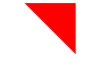
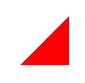
2.8、Triangle Bottom Right
    div {
      height: 0;
      width: 0;
      border-bottom: 100px solid red;
      border-left: 100px solid transparent;
      margin: 100px auto;
    }
后记