视频资源:https://www.bilibili.com/video/BV14J4114768?from=search&seid=3842566320098741425
视频记录 288-297
伪元素选择器使用场景-字体图标
<html lang="en">
<head>
<meta charset="UTF-8">
<meta name="viewport" content="width=device-width, initial-scale=1.0">
<title>伪元素选择器使用场景-字体图标</title>
<style>
@font-face { /*第一步:声明字体*/
font-family: 'icomoon';
src: url('fonts/icomoon.eot?1lv3na');
src: url('fonts/icomoon.eot?1lv3na#iefix') format('embedded-opentype'),
url('fonts/icomoon.ttf?1lv3na') format('truetype'),
url('fonts/icomoon.woff?1lv3na') format('woff'),
url('fonts/icomoon.svg?1lv3na#icomoon') format('svg');
font-weight: normal;
font-style: normal;
font-display: block;
}
div {
position: relative;
width: 200px;
height: 35px;
border: 1px solid red;
}
div::after {
position: absolute; /*子绝父相,不占位置*/
top: 10px;
right: 10px;
font-family: 'icomoon';/*第二步:调用字体*/
content: '\e91e'; /*必须填写*/
color: red;
font-size: 18p;
}
</style>
</head>
<body>
<div></div>
</body>
</html>伪元素选择器使用场景2-仿土豆网显示隐藏遮罩案例
<html lang="en">
<head>
<meta charset="UTF-8">
<meta name="viewport" content="width=device-width, initial-scale=1.0">
<meta http-equiv="X-UA-Compatible" content="ie=edge">
<title>伪元素选择器使用场景2-仿土豆网显示隐藏遮罩案例</title>
<style>
.tudou {
position: relative;
width: 444px;
height: 320px;
background-color: pink;
margin: 30px auto;
}
.tudou img {
width: 100%;
height: 100%;
}
.tudou::before {
content: '';
/* 隐藏遮罩层 */
display: none;
position: absolute; /*加了绝对定位之后,可以指定宽度和高度*/
top: 0;
left: 0;
width: 100%;
height: 100%;
background: rgba(0, 0, 0, .4) url(images/arr.png) no-repeat center;
}
/* 当我们鼠标经过了 土豆这个盒子,就让里面before遮罩层显示出来 */
.tudou:hover::before { /*重点 ::前后不能有空格*/
/* 而是显示元素 */
display: block;
}
</style>
</head>
<body>
<div class="tudou">
<img src="images/tudou.jpg" alt="">
</div>
<div class="tudou">
<img src="images/tudou.jpg" alt="">
</div>
<div class="tudou">
<img src="images/tudou.jpg" alt="">
</div>
<div class="tudou">
<img src="images/tudou.jpg" alt="">
</div>
</body>
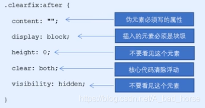
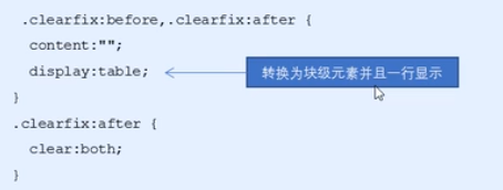
</html>伪元素选择器使用场景3:伪元素清除浮动
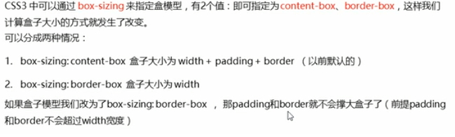
CSS盒子模型
<html lang="en">
<head>
<meta charset="UTF-8">
<meta name="viewport" content="width=device-width, initial-scale=1.0">
<meta http-equiv="X-UA-Compatible" content="ie=edge">
<title>CSS3盒子模型</title>
<style>
* {
margin: 0;
padding: 0;
box-sizing: border-box;/*重点*/
}
div {
width: 200px;
height: 200px;
background-color: pink;
border: 20px solid red;
padding: 15px;
box-sizing: content-box;
}
p {
width: 200px;
height: 200px;
background-color: pink;
border: 20px solid red;
padding: 15px;
/* css3 盒子模型 盒子最终的大小就是 width 200 的大小 */
box-sizing: border-box;
}
</style>
</head>
<body>
<div>
小猪乔治
</div>
<p>
小猪佩奇
</p>
</body>
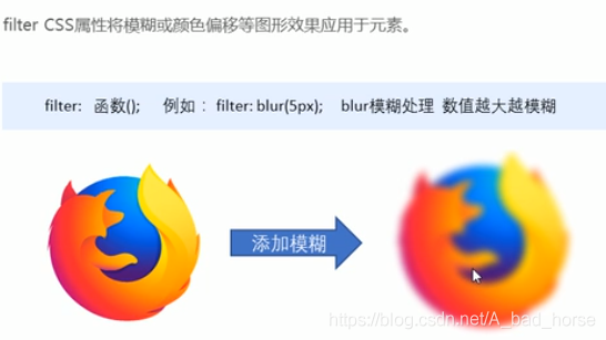
</html>图片变模糊
<html lang="en">
<head>
<meta charset="UTF-8">
<meta name="viewport" content="width=device-width, initial-scale=1.0">
<meta http-equiv="X-UA-Compatible" content="ie=edge">
<title>图片模糊处理filter</title>
<style>
img {
/* blur是一个函数 小括号里面数值越大,图片越模糊 注意数值要加px单位 */
filter: blur(15px);
}
img:hover {
filter: blur(0);
}
</style>
</head>
<body>
<img src="images/pink.jpg" alt="">
</body>
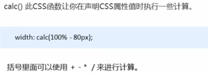
</html>CSS3 calc函数
<html lang="en">
<head>
<meta charset="UTF-8">
<meta name="viewport" content="width=device-width, initial-scale=1.0">
<meta http-equiv="X-UA-Compatible" content="ie=edge">
<title>CSS3属性calc函数</title>
<style>
.father {
width: 300px;
height: 200px;
background-color: pink;
}
.son {
/* width: 150px; */
/* width: calc(150px + 30px); */
width: calc(100% - 30px); /*100%表示和父盒子一样宽*/
height: 30px;
background-color: skyblue;
}
</style>
</head>
<body>
<!-- 需求我们的子盒子宽度永远比父盒子小30像素 -->
<div class="father">
<div class="son"></div>
</div>
</body>
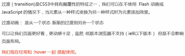
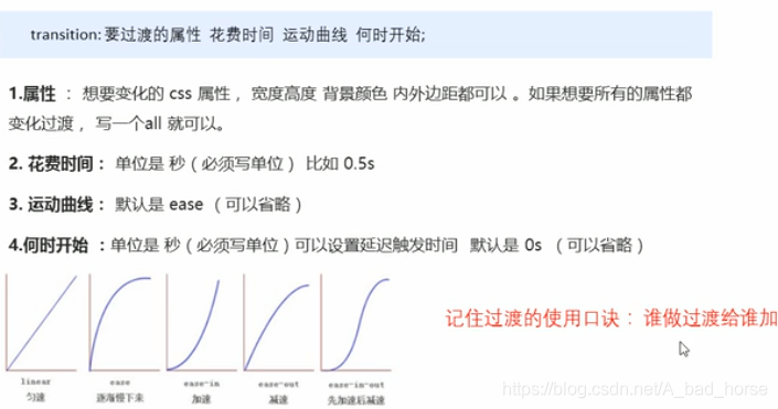
</html>CSS3 过渡
<html lang="en">
<head>
<meta charset="UTF-8">
<meta name="viewport" content="width=device-width, initial-scale=1.0">
<meta http-equiv="X-UA-Compatible" content="ie=edge">
<title>CSS3 过渡效果</title>
<style>
div {
width: 200px;
height: 100px;
background-color: pink;
/* transition: 变化的属性 花费时间 运动曲线 何时开始; */
/* transition: width .5s ease 0s, height .5s ease 1s; */
/* 如果想要写多个属性,利用逗号进行分割 */
/* transition: width .5s, height .5s; */
/* 如果想要多个属性都变化,属性写all就可以了 */
/* transition: height .5s ease 1s; */
/* 谁做过渡,给谁加 */
transition: all 0.5s; /*重点*/
}
div:hover {
width: 400px;
height: 200px;
background-color: skyblue;
}
</style>
</head>
<body>
<div></div>
</body>
</html>进度条案例
<html lang="en">
<head>
<meta charset="UTF-8">
<meta name="viewport" content="width=device-width, initial-scale=1.0">
<title>CSS3过渡练习-进度条</title>
<style>
.bar {
width: 150px;
height: 15px;
border: 1px solid red;
border-radius: 7px;
padding: 1px;
}
.bar_in {
width: 50%;
height: 100%;
background-color: red;
/*谁做过渡给谁加*/
transition: all .7s;
}
.bar:hover .bar_in {
width: 100%;
}
</style>
</head>
<body>
<div class="bar">
<div class="bar_in"></div>
</div>
</body>
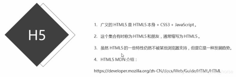
</html>狭义的HTML5+CSS3
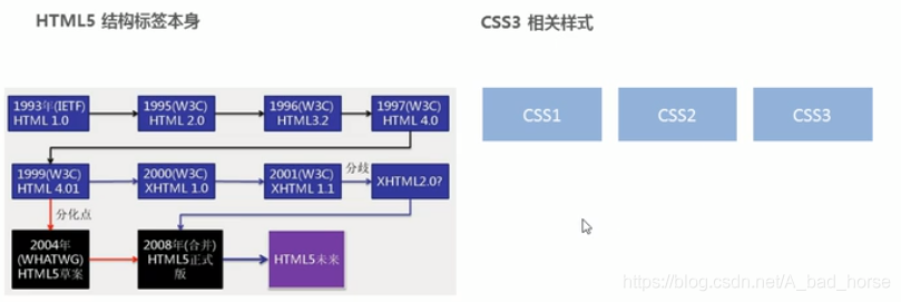
广义的HTML5