好看的搜索框:

<!DOCTYPE html>
<html lang="zh">

<head>
  <meta charset="UTF-8" />
  <meta name="viewport" content="width=device-width, initial-scale=1.0" />
  <meta http-equiv="X-UA-Compatible" content="ie=edge" />
  <title>Awesome search Box</title>
  <link href="https://cdn.bootcss.com/font-awesome/5.8.0/css/all.css" rel="stylesheet" />
 <style>
   body{
  margin: 0;
  padding: 0;
  background: #e84118;
 }
.search-box{
  position: absolute;
  top:50%;
  left: 50%;
  transform: translate(-50%,-50%);
  background: #2f3640;
  border-radius: 40px;
  padding: 10px;
}
.search-btn{
  color: #e84118;
  float: right;
  width: 40px;
  height: 40px;
  border-radius: 50%;
  background: #2f3640;
  display: flex;
  justify-content: center;
  align-items: center;
}
.search-txt{
  border: none;
  background: none;
  outline: none;
  float: left;
  padding: 0;
  color: white;
  font-size: 16px;
  transition: 0.4s;
  line-height: 40px;
  width: 0;
}
.search-box:hover > .search-txt {
  width: 240px;
  padding: 0 6px;
}
.search-box:hover > .search-btn {
  background: white;
}

 </style>

</head>

<body>
  <div class="search-box">
    <input class="search-txt" type="text" placeholder="Type to search" />
    <a class="search-btn" href="#">
      <i class="fas fa-search"></i>
    </a>
  </div>
</body>

</html>

<!DOCTYPE html>
<html lang="en">
  <head>
    <meta charset="UTF-8" />
    <meta name="viewport" content="width=device-width, initial-scale=1.0" />
    <meta http-equiv="X-UA-Compatible" content="ie=edge" />
    <title>Loading1</title>
    <style>
      body {
        margin: 0;
        padding: 0;
        background: #333;
      }
      .middle {
        position: absolute;
        top: 50%;
        left: 50%;
        transform: translate(-50%, -50%);
      }
      .bar {
        width: 6px;
        height: 2px;
        background: white;
        display: inline-block;
        transform-origin: bottom center;
        animation: loading 1.5s ease-in-out infinite;
      }
      .bar1 {
        animation-delay: 0.1s;
      }
      .bar2 {
        animation-delay: 0.2s;
      }
      .bar3 {
        animation-delay: 0.3s;
      }
      .bar4 {
        animation-delay: 0.4s;
      }
      .bar5 {
        animation-delay: 0.5s;
      }
      .bar6 {
        animation-delay: 0.6s;
      }
      .bar7 {
        animation-delay: 0.7s;
      }
      .bar8 {
        animation-delay: 0.8s;
      }
      @keyframes loading {
        0% {
          transform: scaleY(0.1);
          background: #fff;
        }
        50% {
          transform: scaleY(30);
          background: #2ecc71;
        }
        100% {
          transform: scaleY(0.1);
          background: transparent;
        }
      }
    </style>
  </head>
  <body>
    <div class="middle">
      <div class="bar bar1"></div>
      <div class="bar bar2"></div>
      <div class="bar bar3"></div>
      <div class="bar bar4"></div>
      <div class="bar bar5"></div>
      <div class="bar bar6"></div>
      <div class="bar bar7"></div>
      <div class="bar bar8"></div>
    </div>
  </body>
</html>
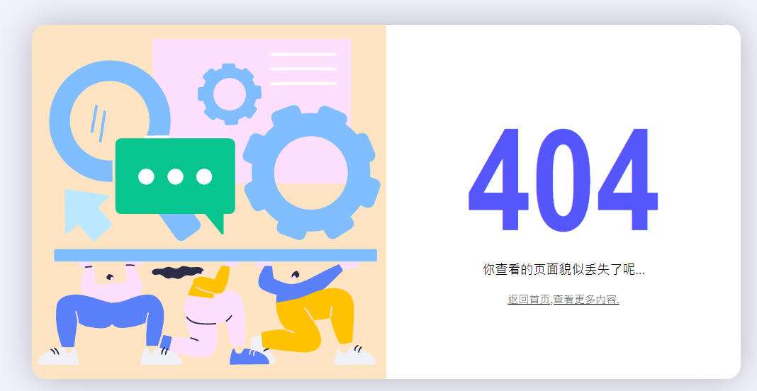
<!DOCTYPE html>
<html lang="en">
<head>
  <meta charset="UTF-8">
  <meta name="viewport" content="width=device-width, initial-scale=1.0">
  <link rel="stylesheet" href="css/style.css">
  <title>404 - 页面丢失啦</title>
</head>
<body>
  <div class="main-container">
    <div class="img-container container-item">
      <img src="./static/404.svg">
    </div>
    <div class="text-container container-item">
      <div class="code">404</div>
      <div class="msg">你查看的页面貌似丢失了呢...</div>
      <div class="action">返回首页,查看更多内容.</div>
    </div>
  </div>
</body>
</html>
* {
  padding: 0;
  margin: 0;
}

html,body {
  height: 100%;
}

body {
  background-color: rgba(223, 223, 255, 0.39);
  display: flex;
  justify-content: center;
  align-items: center;
}

.main-container {
  width: 80%;
  max-width: 1000px;
  max-height: 500px;
  min-width: 600px;
  background-color: white;
  font-size: 0;
  border-radius: 20px;
  box-shadow: 0 0 50px 0 rgba(146, 146, 146, 0.63);
}

.main-container .container-item {
  display: inline-block;
  vertical-align: middle;
  width: 50%;
}

.main-container .img-container {
  background-color: rgba(253, 216, 168, 0.692);
  border-top-left-radius: 20px;
  border-bottom-left-radius: 20px;
}

.main-container .text-container .code {
  font-size: clamp(150px,20vw,200px);
  font-family: 'Arial Narrow';
  color: rgb(86, 86, 253);
  font-weight: bolder;
  text-align: center;
}

.main-container .text-container .msg {
  font-size: 18px;
  text-align: center;
  font-weight: 200;
  margin-bottom: 20px;
}

.main-container .text-container .action {
  font-size: 15px;
  font-weight: 200;
  text-align: center;
  text-decoration-line: underline;
  cursor: pointer;
}
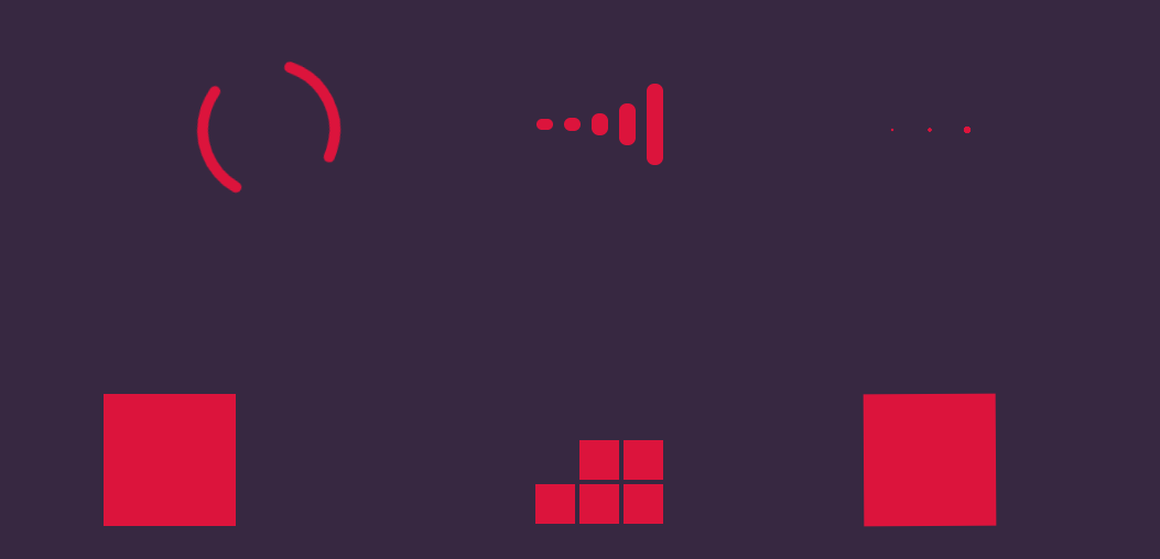
<!DOCTYPE html>
<html lang="en">
<head>
  <meta charset="UTF-8">
  <meta name="viewport" content="width=device-width, initial-scale=1.0">
  <style>
    *{
      padding: 0;
      margin: 0;
    }
    html{
      height: 100%;
    }
    body{
      background-color:  rgb(55, 40, 65);
    }
    .main-container{
      color: aliceblue;
      padding-top: 100px;
    }
    .line-container{
      width: 910px;
      height: 300px;
      margin: 0 auto;
      display: flex;
      flex-direction: row;
    }
    .line-container .loading{
      width: 300px;
      text-align: center;
    }
    .line-container .loading.loading1{
      animation: loading1-rotate 2s infinite 0s;
    }
    .line-container .loading.loading1 .item {
      stroke: crimson;
      stroke-dasharray:100;
      stroke-width: 10;
      stroke-linecap: round;
      fill: none;
    }
    @keyframes loading1-rotate{
      0%{
        transform: rotate(0);
      }
      100% {
        transform: rotate(360deg);
     }
    }

    /* 第二个的样式 */
    .loading2 .wrapper {
      height: 100%;
      margin: 0 auto;
      font-size: 0;
    }
    .loading2 .wrapper .item {
      background-color: crimson;
      width: 15px;
      height: 0px;
      display: inline-block;
      font-size: 0;
      margin: 0 5px;
      position: relative;
      transform: translateY(145px);
    }
    .loading2 .wrapper .item::before {
      content: '';
      height: 50px;
      width: 15px;
      position: absolute;
      bottom: 0;
      left: 0;
      border-top-left-radius: 8px;
      border-top-right-radius: 8px;
      background-color: crimson;
    }

    .loading2 .wrapper .item::after{
      content: '';
      position: absolute;
      top: 0;
      left: 0;
      height: 50px;
      width: 15px;
      border-bottom-left-radius: 8px;
      border-bottom-right-radius: 8px;
      background-color: crimson;
    }

    .loading2 .wrapper .item:nth-child(1)::before{
      animation: loading2 2s infinite 0s;
    }
    .loading2 .wrapper .item:nth-child(2)::before {
      animation: loading2 2s infinite .2s;
    }
    .loading2 .wrapper .item:nth-child(3)::before {
      animation: loading2 2s infinite .4s;
    }
    .loading2 .wrapper .item:nth-child(4)::before {
      animation: loading2 2s infinite .6s;
    }
   .loading2 .wrapper .item:nth-child(5)::before {
     animation: loading2 2s infinite .8s;
    }

    .loading2 .wrapper .item:nth-child(1)::after {
  animation: loading2 2s infinite 0s;
}
.loading2 .wrapper .item:nth-child(2)::after {
  animation: loading2 2s infinite .2s;
}
.loading2 .wrapper .item:nth-child(3)::after {
  animation: loading2 2s infinite .4s;
}
.loading2 .wrapper .item:nth-child(4)::after {
  animation: loading2 2s infinite .6s;
}
.loading2 .wrapper .item:nth-child(5)::after {
  animation: loading2 2s infinite .8s;
}

@keyframes loading2 {
  0% {
    height: 50px;
  }
  50% {
    height: 5px;
  }
  100% {
    height: 50px;
  }
}


.loading3 .wrapper{
  text-align: center;
}
.loading3 .wrapper .item{
  display: inline-block;
  height: 30px;
  width: 30px;
  font-size: 0;
  transform: translateY(135px);
}
.loading3 .wrapper .item::before {
 content: '';
 display: inline-block;
 height: 30px;
 width: 30px;
 background-color: crimson;
 border-radius: 15px;
}


.loading3 .wrapper .item:nth-child(1)::before {
  animation: loading3 2s infinite 0s;
}
.loading3 .wrapper .item:nth-child(2)::before {
  animation: loading3 2s infinite 0.2s;
}
.loading3 .wrapper .item:nth-child(3)::before {
  animation: loading3 2s infinite 0.4s;
}

@keyframes loading3 {
  0% {
    transform: scale(1);
  }
  50% {
    transform: scale(0.1);
  }
  100% {
    transform: scale(1);
  }
}

.loading4 .item {
  width: 100px;
  height: 100px;
  border: 10px solid crimson;
  margin-top: 90px;
  animation: loading4-box 2s infinite 0s;
}
.loading4 .item::before {
  content: '';
  display: inline-block;
  vertical-align: top;
  width: 100px;
  height: 0px;
  background-color: crimson;
  animation: loading4 2s infinite 0s;
}

@keyframes loading4-box{
  0% {
    transform: rotate(0deg);
  }
  25% {
    transform: rotate(0deg);
  }
  50% {
    transform: rotate(180deg);
  }
  75% {
    transform: rotate(180deg);
  }
  100% {
    transform: rotate(360deg);
  }
}

@keyframes loading4 {
  0% {
    height: 0px;
  }
  25% {
    height: 100px;
  }
  50% {
    height: 100px;
  }
  75% {
    height: 0px;
  }
  100% {
    height: 0px;
  }
}

.loading5 .wrapper{
  height: 120px;
  width: 120px;
  display: flex;
  flex-flow: row wrap;
  transform: translateX(90px) translateY(90px);
}

.loading5 .wrapper .item {
  width: 36px;
  height: 36px;
  background-color: crimson;
  font-size: 0;
  margin: 2px;
}

.loading5 .wrapper .item:nth-child(1){
  animation: loading5 4s infinite 0s;
}
.loading5 .wrapper .item:nth-child(2){
  animation: loading5 4s infinite 0.25s;
}
.loading5 .wrapper .item:nth-child(3){
  animation: loading5 4s infinite 0.5s;
}

.loading5 .wrapper .item:nth-child(4){
  animation: loading5 4s infinite 0.75s;
}
.loading5 .wrapper .item:nth-child(5){
  animation: loading5 4s infinite 1s;
}
.loading5 .wrapper .item:nth-child(6){
  animation: loading5 4s infinite 1.25s;
}

.loading5 .wrapper .item:nth-child(7){
  animation: loading5 4s infinite 1.5s;
}
.loading5 .wrapper .item:nth-child(8){
  animation: loading5 4s infinite 1.75s;
}
.loading5 .wrapper .item:nth-child(9){
  animation: loading5 4s infinite 2s;
}

@keyframes loading5{
  0% {
    transform: translateY(0px);
    opacity: 1;
  }
  5% {
    transform: translateY(20px);
    opacity: 0;
  }
  45% {
    transform: translateY(20px);
    opacity: 0;
  }
  55% {
    transform: translateY(0px);
    opacity: 1;
  }
  100% {
    transform: translateY(0px);
    opacity: 1;
  }
}

.loading6 {
  animation:loading6 2s infinite linear 0s;
}
@keyframes loading6{
  0% {
    transform: rotate(0deg);
  }
  100% {
    transform: rotate(360deg);
  }
}
.loading6 .item{
  width: 120px;
  height: 120px;
  background-color: crimson;
  transform: translateX(90px) translateY(90px);
  animation: loading6-item 2s infinite linear 0s;
}

@keyframes loading6-item {
  0% {
    border-radius: 0;
  }
  12.5% {
    border-bottom-right-radius: 60px;
  }
  25% {
    border-radius: 0;
  }
  37.5% {
    border-top-right-radius: 60px;
  }
  50% {
    border-radius: 0;
  }
  62.5% {
    border-top-left-radius: 60px;
  }
  75% {
    border-radius: 0;
  }
  87.5% {
    border-bottom-left-radius: 60px;
  }
  100% {
    border-radius: 0;
  }
}

  </style>
  <title>Loading...</title>
</head>
<body>
  <div class="main-container">
    <div class="line-container">
      <div class="loading loading1">
        <svg class="load" width="300" height="300">
          <circle class="item" cx="150" cy="150" r=60></circle>
        </svg>
      </div>
      <div class="loading loading2">
        <div class="wrapper">
          <div class="item"></div>
          <div class="item"></div>
          <div class="item"></div>
          <div class="item"></div>
          <div class="item"></div>
        </div>
      </div>
      <div class="loading loading3">
        <div class="wrapper">
          <div class="item"></div>
          <div class="item"></div>
          <div class="item"></div>
        </div>
      </div>
    </div>
    <div class="line-container">
      <div class="loading loading4">
        <div class="item"></div>
      </div>
      <div class="loading loading5">
        <div class="wrapper">
          <div class="item"></div>
          <div class="item"></div>
          <div class="item"></div>
          <div class="item"></div>
          <div class="item"></div>
          <div class="item"></div>
          <div class="item"></div>
          <div class="item"></div>
          <div class="item"></div>
        </div>
      </div>
      <div class="loading loading6">
        <div class="item"></div>
      </div>
    </div>
  </div>
</body>
</html>
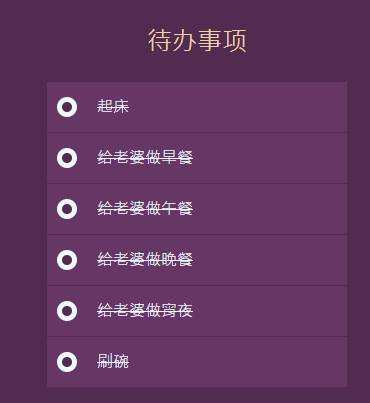
代办事件:
<!DOCTYPE html>
<html lang="en">
<head>
  <meta charset="UTF-8">
  <meta name="viewport" content="width=device-width, initial-scale=1.0">
  <link rel="stylesheet" href="css/style.css">


  <title>Todo List</title>
</head>
<body>
  <div class="main-container">
    <div class="header">
      待办事项
    </div>
    <div class="list-container">
      <ul>
        <li><label><input type="checkbox"><span>起床</span></label></li>
        <li><label><input type="checkbox"><span>给老婆做早餐</span></label></li>
        <li><label><input type="checkbox"><span>给老婆做午餐</span></label></li>
        <li><label><input type="checkbox"><span>给老婆做晚餐</span></label></li>
        <li><label><input type="checkbox"><span>给老婆做宵夜</span></label></li>
        <li><label><input type="checkbox"><span>刷碗</span></label></li>
      </ul>
    </div>
  </div>
</body>
</html>
* {
padding: 0;
margin: 0;
}
html,body {
height: 100%;
}
body {
background-color: rgb(81, 43, 80);
display: flex;
justify-content: center;
align-items: center;
}
.main-container {
width: 300px;
}
.main-container .header {
font-size: 25px;
color: rgb(240, 208, 167);
text-align: center;
line-height: 80px;
}
.main-container .list-container > ul {
list-style: none;
}
.main-container .list-container > ul >li {
height: 50px;
background-color: rgb(182, 104, 118);
font-size: 16px;
font-weight: 200;
line-height: 50px;
color: aliceblue;
position: relative;
border-bottom: 1px solid rgb(81, 43, 80);
z-index: 1;
}
.main-container .list-container > ul >li>label>span {
display: block;
position: absolute;
top: 0;
left: 0;
height: 50px;
width: calc(100% - 70px);
padding: 0 20px 0 50px;
user-select: none;
transition: .5s;
}
input[type='checkbox'] {
width: 0;
}
input[type='checkbox']::before {
width: 10px;
height: 10px;
content: '';
display: block;
background-color: aliceblue;
border: 5px solid aliceblue;
border-radius: 20px;
position: absolute;
top: calc(50% - 10px);
left: 10px;
z-index: 3;
transition: .5s;
}
input[type='checkbox']:checked::before {
background-color: rgb(81, 43, 80);
}
input[type='checkbox']:checked+span {
background-color: rgb(102, 55, 100);
text-decoration: line-through;
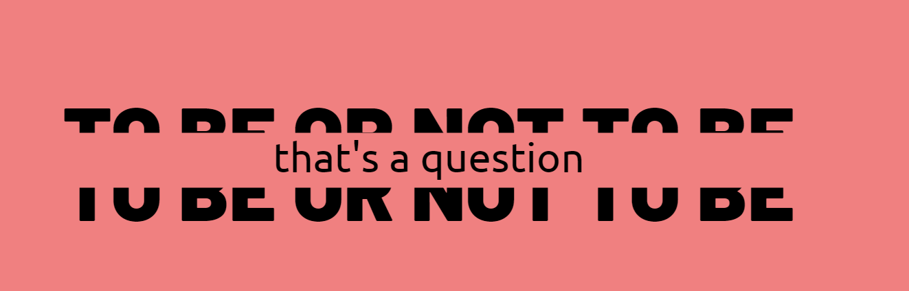
}拆分汉字:
<!DOCTYPE html>
<html lang="en">
<head>
  <meta charset="UTF-8">
  <meta name="viewport" content="width=device-width, initial-scale=1.0">
  <link href="https://fonts.googleapis.com/css2?family=Barlow:wght@900&family=Ubuntu&display=swap" rel="stylesheet">
  <link rel="stylesheet" href="css/style.css">
  <title>to be or not to be,that's a question</title>
</head>
<body>
  <div class="main-container">
    <div class="text">to be or not to be</div>
    <div class="inner-text">that's a question</div>
    <div class="text">to be or not to be</div>
  </div>
</body>
</html>
* {
padding: 0;
margin: 0;
}
html,body {
height: 100%;
}
body {
background-color: lightcoral;
display: flex;
justify-content: center;
align-items: center;
}
.main-container {
width: 100%;
height: 120px;
text-align: center;
position: relative;
transition: .5s;
}
.main-container .text {
font-family: 'Barlow', sans-serif;
font-size: 120px;
line-height: 120px;
height: 120px;
text-transform: uppercase;
position: absolute;
top: 0;
text-align: center;
width: 100%;
}
.main-container .text:nth-child(1) {
clip-path: polygon(0 0, 100% 0, 100% 50%, 0 50%);
}
.main-container .text:nth-child(3) {
clip-path: polygon(0 50%, 100% 50%, 100% 100%, 0 100%);
transition: .5s;
}
.main-container .inner-text {
height: 0px;
overflow: hidden;
font-family: 'Ubuntu', sans-serif;
transform: scale(1,0);
position: absolute;
top: 60px;
width: 100%;
font-size: 60px;
line-height: 70px;
transition: .5s;
text-align: center;
}
.main-container:hover {
height: 190px;
}
.main-container:hover .inner-text {
height: 70px;
transform: scale(1,1);
}
.main-container:hover .text:nth-child(3) {
top: 80px;
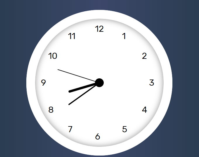
}会走的时钟:
<!DOCTYPE html>
<html lang="en">
<head>
  <meta charset="UTF-8">
  <meta name="viewport" content="width=device-width, initial-scale=1.0">
  <link href="https://fonts.googleapis.com/css2?family=Rubik&display=swap" rel="stylesheet">
  <!-- <link rel="stylesheet" href="css/style.css"> -->
  <style>
* {
  padding: 0;
  margin: 0;
}

html,body {
  height: 100%;
}

body {
  background-image: linear-gradient(to right,#203744,#3c4769,#203744);
  display: flex;
  justify-content: center;
  align-items: center;
}

.clock-container {
  width: 500px;
  height: 500px;
  background-color: white;
  border-radius: 300px;
}

.clock-container .panel-container {
  height: 440px;
  border: 30px solid rgb(255, 255, 255);
  border-radius: 300px;
  box-shadow: 0 0 20px 0 rgba(7, 7, 7, 0.459) inset;

  display: flex;
  align-items: center;
  justify-content: center;
}

.clock-container .panel-container .box {
  position: relative;
  width: 400px;
  height: 400px;
  display: flex;
  align-items: center;
}

.clock-container .panel-container .box .num,.point,.hand {
  position: absolute;
  font-size: 30px;
  line-height: 30px;
  height: 30px;
  font-family: 'Rubik', sans-serif;
  width: 100%;
}

.clock-container .panel-container .box .num span {
  display: inline-block;
  width: 30px;
}

.clock-container .panel-container .box .num:nth-child(1){
  transform: rotate(120deg);
}
.clock-container .panel-container .box .num:nth-child(2){
  transform: rotate(150deg);
}
.clock-container .panel-container .box .num:nth-child(3){
  transform: rotate(180deg);
}
.clock-container .panel-container .box .num:nth-child(4){
  transform: rotate(210deg);
}
.clock-container .panel-container .box .num:nth-child(5){
  transform: rotate(240deg);
}
.clock-container .panel-container .box .num:nth-child(6){
  transform: rotate(270deg);
}
.clock-container .panel-container .box .num:nth-child(7){
  transform: rotate(300deg);
}
.clock-container .panel-container .box .num:nth-child(8){
  transform: rotate(330deg);
}
.clock-container .panel-container .box .num:nth-child(9){
  transform: rotate(360deg);
}
.clock-container .panel-container .box .num:nth-child(10){
  transform: rotate(390deg);
}
.clock-container .panel-container .box .num:nth-child(11){
  transform: rotate(420deg);
}
.clock-container .panel-container .box .num:nth-child(12){
  transform: rotate(450deg);
}


.clock-container .panel-container .box .num:nth-child(1) span{
  transform: rotate(-120deg);
}
.clock-container .panel-container .box .num:nth-child(2) span{
  transform: rotate(-150deg);
}
.clock-container .panel-container .box .num:nth-child(3) span{
  transform: rotate(-180deg);
}
.clock-container .panel-container .box .num:nth-child(4) span{
  transform: rotate(-210deg);
}
.clock-container .panel-container .box .num:nth-child(5) span{
  transform: rotate(-240deg);
}
.clock-container .panel-container .box .num:nth-child(6) span{
  transform: rotate(-270deg);
}
.clock-container .panel-container .box .num:nth-child(7) span{
  transform: rotate(-300deg);
}
.clock-container .panel-container .box .num:nth-child(8) span{
  transform: rotate(-330deg);
}
.clock-container .panel-container .box .num:nth-child(9) span{
  transform: rotate(-360deg);
}
.clock-container .panel-container .box .num:nth-child(10) span{
  transform: rotate(-390deg);
}
.clock-container .panel-container .box .num:nth-child(11) span{
  transform: rotate(-420deg);
}
.clock-container .panel-container .box .num:nth-child(12) span{
  transform: rotate(-450deg);
}

.clock-container .panel-container .box .point{
  text-align: center;
}

.clock-container .panel-container .box .point span {
  display: inline-block;
  width: 30px;
  height: 30px;
  border-radius: 20px;
  background-color: black;
}
.clock-container .panel-container .box .hand{
  display: flex;
  align-items: center;
}
.clock-container .panel-container .box .hand span {
  background-color: black;
  display: block;
}

.clock-container .panel-container .box .hand.second span {
  width: calc(50% - 50px);
  height: 2px;
  border-radius: 4px;
  margin-left: 50px;
}
.clock-container .panel-container .box .hand.minute span {
  width: calc(50% - 70px);
  height: 4px;
  border-radius: 4px;
  margin-left: 70px;
}
.clock-container .panel-container .box .hand.hour span {
  width: calc(50% - 90px);
  height: 8px;
  border-radius: 4px;
  margin-left: 90px;
}

.clock-container .panel-container .box .hand.second {
  animation: clock-run 60s linear infinite;
}
.clock-container .panel-container .box .hand.minute {
  animation: clock-run 3600s linear infinite;
}
.clock-container .panel-container .box .hand.hour {
  animation: clock-run 86400s linear infinite;
}

@keyframes clock-run {
  0% {
    transform: rotate(0deg);
  }
  100% {
    transform: rotate(360deg);
  }
}
</style>
  <title>会走的时钟</title>
</head>
<body>
  <div class="clock-container">
    <div class="panel-container">
      <div class="box">
        <div class="num"><span>1</span></div>
        <div class="num"><span>2</span></div>
        <div class="num"><span>3</span></div>
        <div class="num"><span>4</span></div>
        <div class="num"><span>5</span></div>
        <div class="num"><span>6</span></div>
        <div class="num"><span>7</span></div>
        <div class="num"><span>8</span></div>
        <div class="num"><span>9</span></div>
        <div class="num"><span>10</span></div>
        <div class="num"><span>11</span></div>
        <div class="num"><span>12</span></div>
        <div class="point"><span></span></div>
        <div class="hand second"><span></span></div>
        <div class="hand minute"><span></span></div>
        <div class="hand hour"><span></span></div>
      </div>
    </div>
  </div>
</body>
</html>
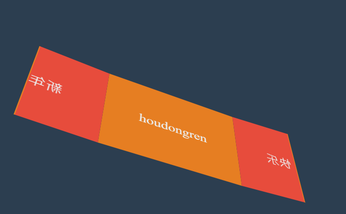
新年贺卡:
*{
    padding: 0;
    margin: 0;
  }
  body{
    width: 100vw;
    height: 100vh;
    display: flex;
    justify-content: center;
    align-items: center;
    background: #2c3e50;
  }
  .card{
    width: 300px;
    height: 200px;
    background: #e67e22;
    display: flex;
    justify-content: center;
    align-items: center;
    font-size: 2em;
    color: #ecf0f1;
    position: relative;
    transform-style: preserve-3d;
    transform: perspective(900px) rotateX(45deg) rotateY(25deg);
  }
  .card::before,
  .card::after{
    transition: 2s;
    background: #e74c3c;
    width: 50%;
    height: 100%;
    position: absolute;
    box-sizing: border-box;
  }
  .card::before{
    content: '新年';
    left:0;
    top: 0;
    display: flex;
    align-items: center;
    justify-content: flex-end;
    transform-origin: left;
    border-right: solid 2px #e67e22;
    padding-left: 10px;
  }
  .card::after{
    content: '快乐';
    right: 0;
    top: 0;
    display: flex;
    align-items: center;
    justify-content: flex-start;
    transform-origin: right;
    border-left: solid 2px #e67e22;
    padding-left: 10px;
  }
  .card:hover::before{
    transform: rotateY(-180deg);
  }
  .card:hover::after{
    transform: rotateY(180deg);
  }


